
Weekly Woodcut Number 5.
An area of early woodblock printing that I positively have to include is the creation of movable type in 11th century China, some 400 years before the introduction of movable type in Europe.


“The invention of Chinese movable type is a remarkable milestone in the history of printing, as it ushered in a new printing era, well before the well-known developments in Europe. Chinese movable type printing has been used for nearly one thousand years and greatly promoted the development and exchange of world culture; in addition it contributed to the historical progression of world civilization.”
An except from an article on Chinese movable type by Shuo Wang, Ardeshir Osanlou, and Peter Excell here

Movable type involves making individual characters which can be arranged to make a body of text then reused. In China the first movable type was created by Bi Sheng (990-1051) and initially made from clay, something which would have developed naturally from carved clay blocks made for decoration and stamping documents.
However the small clay pieces were fragile and tricky to get flat for printing. Here is a detailed description of the technical details of Bi Sheng’s invention:
During the reign of Chingli 慶曆 (Qìnglì), 1041–1048, Bi Sheng, a man of unofficial position, made movable type. His method was as follows: he took sticky clay and cut in it characters as thin as the edge of a coin. Each character formed, as it were, a single type. He baked them in the fire to make them hard. He had previously prepared an iron plate and he had covered his plate with a mixture of pine resin, wax, and paper ashes. When he wished to print, he took an iron frame and set it on the iron plate. In this, he placed the types, set close together. When the frame was full, the whole made one solid block of type. He then placed it near the fire to warm it. When the paste [at the back] was slightly melted, he took a smooth board and pressed it over the surface, so that the block of type became as even as a whetstone. For each character, there were several types, and for certain common characters, there were twenty or more types each. When the characters were not in use he had them arranged with paper labels, one label for each rhyme-group, and kept them in wooden cases.
Translation by Tsien, Tsuen-Hsuin (1985). “part one, vol. 5”, in Joseph Needham, Science and Civilisation in China: Paper and Printing. Cambridge: Cambridge University Press. Page 201-202.
If anyone has tried western letterpress printing, the flatness of the type block surface is crucial to achieve an even print especially on a press. With hand printing there is slightly more leeway but still it is difficult to achieve that nice even impression.
As the fragility of these early clay pieces was an issue the characters were later cut in wood and ultimately cast in metal.
Despite this promising early start, because of the complex processes and the need for a certain level of literacy to assemble the texts, movable type was not further developed until the 13th Century when the astonishingly multi talented inventor Wang Zhen developed the use of wooden type and a very neat revolving typecase.
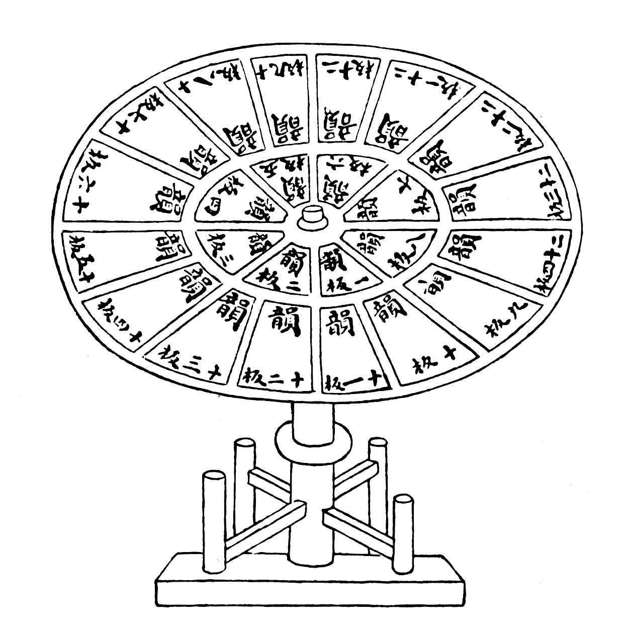

A revolving table typecase with individual movable type characters arranged primarily by rhyming scheme, from Wang Zhen’s “Nong Shu”, published in 1313 CE.
See this short Unesco video from 2010 about the only villages left cutting and printing movable type in China: “Wooden movable-type printing of China”
I found it interesting to read that because of the vast numbers of characters in the Chinese language, and the complexities of the process, the early printed documents were limited to fairly simple language, and to mainly administrative documents and family registers, which rather delayed for some time the printing and popularisation of literary and philosophical works.
Some of the earliest works to be printed were medical books which I will be coming to later. I can’t wait because they are wonderful.

Here is a beautiful spread showing salt preparation from “Chong xiu zheng he jing shi zheng lei bei yong ben cao”, an edition of the classic materia medica printed in early Yuan in 1249. From the Library of Congress. here
![]()
Fu and a Piece of Type
Part of the plan for this project is to improve my overall printing and as we are still in the middle of Chinese New Year celebrations I decided to try and make a woodblock of the Chinese “fu” good fortune symbol, printed in the traditional way with a baren and watercolour. I have tried this form of printing quite a few times and love the soft quality of the watercolour on Japanese paper. But it is tricky.
The aim of the early Chinese and Japanese woodblock printmakers was to “copy” brush lettering to emulate a hand written document. The slightly broken edges and brush marks at the ends of the stroke making it more like brushwork. It’s called a “Kasure” cutting technique.
I think I am improving somewhat and have at least one decent print with bokashi ( shaded colouring) and woodgrain showing.
FU… “Good Fortune”

Fu and the block…Handprinted on hosho paper with watercolours
Should you make your own Fu symbol, for even better luck during the spring festival, hang the the symbol upside down. This is because “the phrase an “upside-down Fú” sounds nearly identical to the phrase “Good luck arrives”. Pasting the character upside-down on a door or doorpost thus translates into a wish for prosperity to descend upon a dwelling.” see Wiki here.
A Character Block and Shards of wood.
For an alternative I decided to make a reduction print of a character block with its cast shadow and I’ve included some of the shards of wood which clutter up my workspace almost daily at the moment. This is more an exercise in registration and overprinting than cutting. The trick is to print lots and lots and lots of the first colours so you have enough to work on as you cut away the layers. I never print enough..

Block and print after 3rd colour

Block and print after 5th colour .. not much left of the block now!

A couple of stages of the colours before overprinting

I made one set based on blues and another with a yellow as the first colour.

“Type block” 5 colour reduction woodcut. 5 inches square.
Next week more fabric..
Hi Val, what a journey I am embarking on. A Journey into Obsession……
The White Road.
Thanks to you 🙂
I am loving this project and can’t wait to see the printing on fabric.
Gay xx
Upside down – like a nailed up horseshoe, so the luck doesn’t drain out. How strange that that should echo across.