The Delight of Returning Frogs

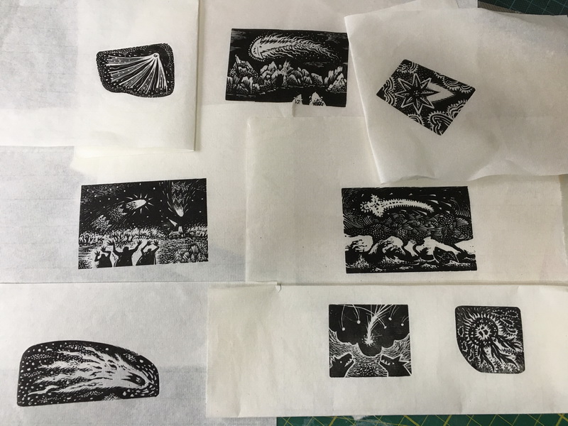
As always at this time of year we wait for the joyful return of the frogs and after a seemingly endless dreary winter they arrived, about 2 weeks ago.

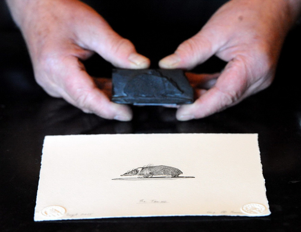
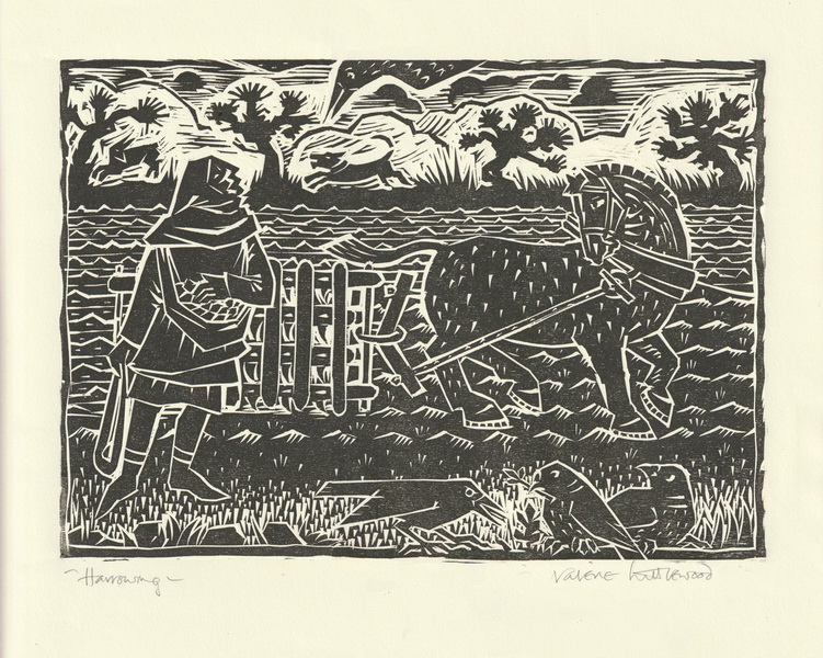
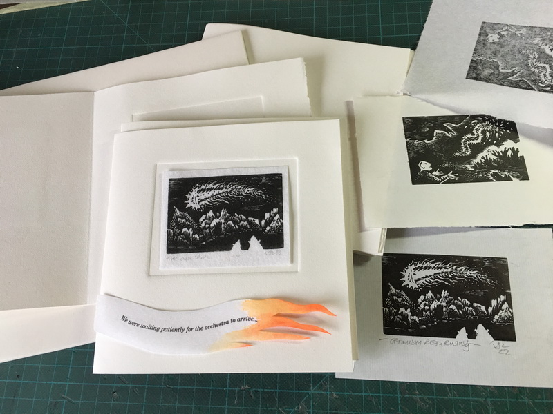
I like to mark this time each year somehow, last year it was a trial woodblock here. That was late Feb. The year before I ressurected my “Chris the frog” woodcut and added a some lunch for him.

That was March 30th. I have noticed the times are quite different from year to year I think dependant on the warmth of the water.

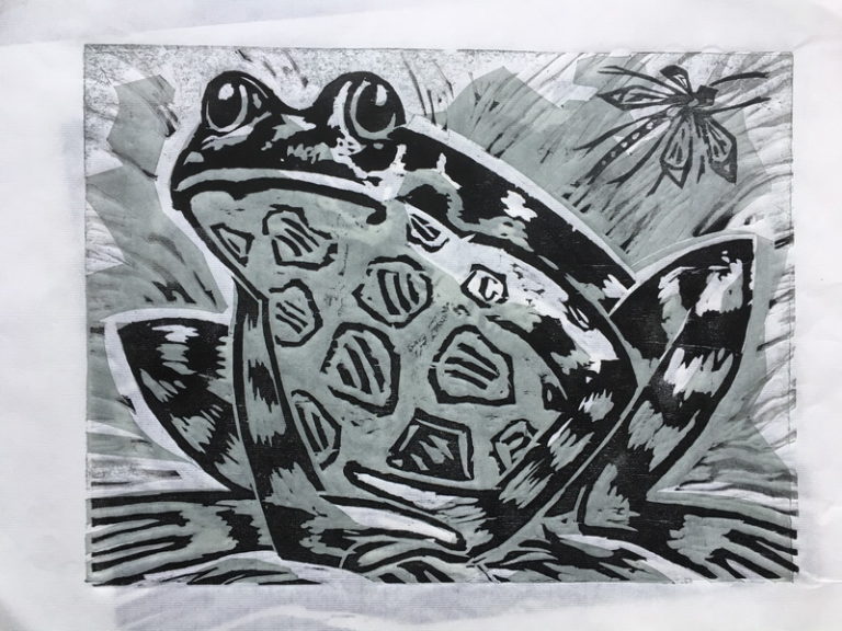
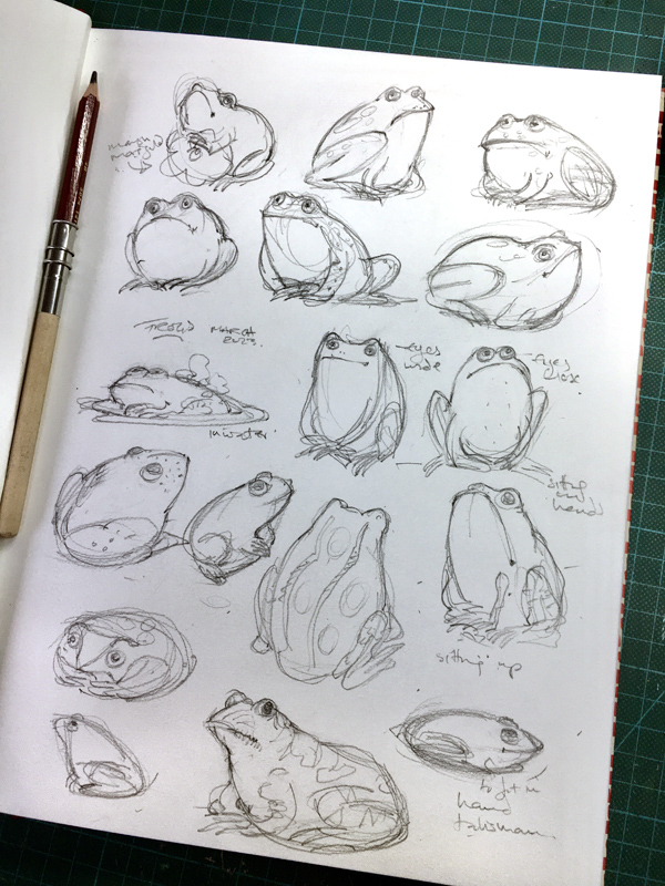
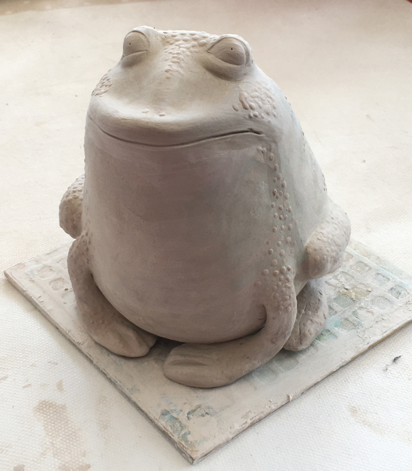
This year I am making a ceramic frog. It’s only in clay form at the moment and so won’t be ready to show properly for a few weeks. So I am posting a fabulous painting by the prolific Japanese painter,  Kawanabe Kyōsai 河鍋暁斎

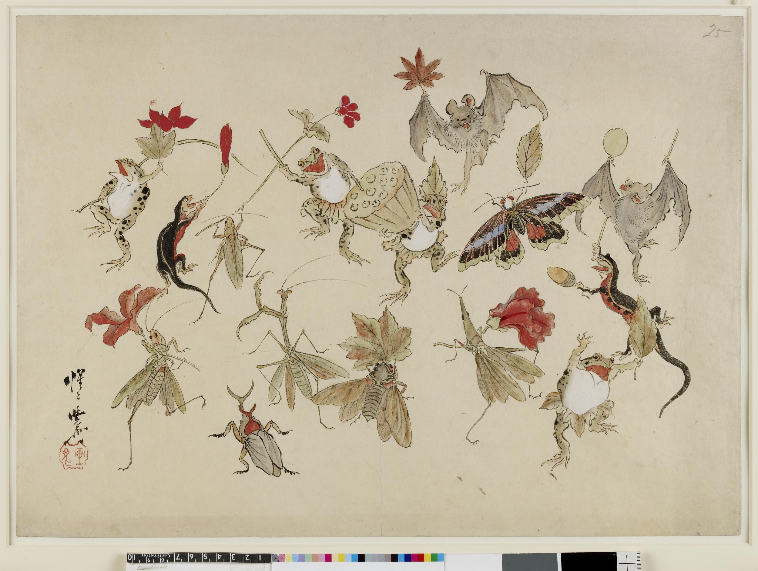
“Sketch. Animals and insects with autumn fruits and leaves. Ink and colours on paper”

British Museum:  Museum number1881,1210,0.1871 

There are many wonderful  Kyosai natural history drawings, so full of life and affection for all the strange small creatures, who in this painting are actually celebrating autumn. I chose this one from his many frog paintings as it also contains some other favourites of mine, bats, lizards, grasshoppers, bugs and a mantis.

But there is so much more to this wonderful painter/printmaker. He was a political comentator at a time when western influences were starting to make changes to Japan and its culture. He was known for having a [articular fondness for sake,  partaking in drunken shogakai calligraphy parties. It’s something I haven’t tried yet but I am wondering if it might be hugely beneficial to my work. It’s defintitely worth a try.
Read more about him in an article in Art News about a recent UK exhibition at the RA. I would very much like to have seen it.

The frog in Japanese culture is considered lucky and I have read that the word for frog “kaeru” is pronounced in the same way as “return”. Travellers would carry a frog amulet with them to ensure a safe homeward journey. How lovely! I shall have to make some small frogs as well.

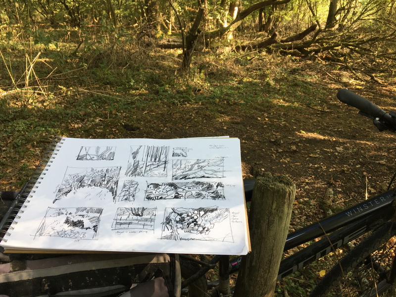
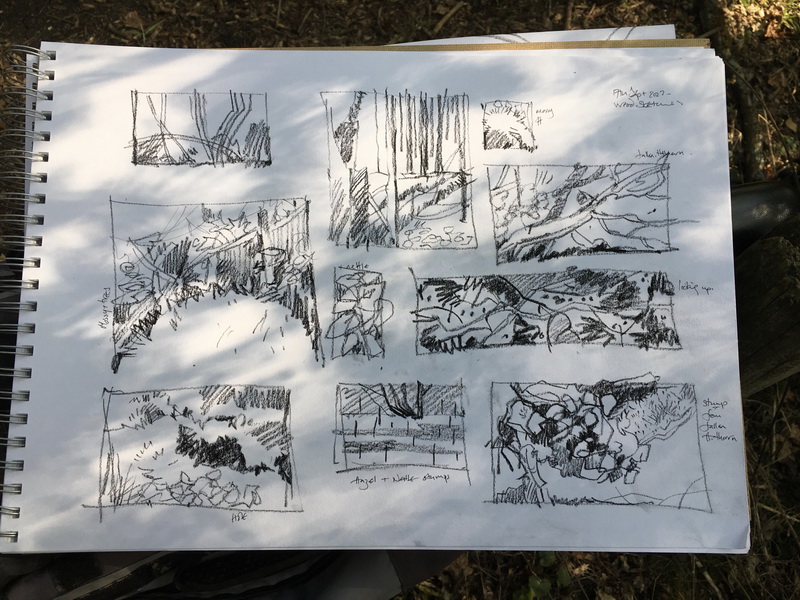
I made a few prelim sketches knowing I wanted a sitting frog. It’s how we often see them in the summer. Sitting by the small ponds in the sun.


Welcome February!… and a few Comets

How wonderful to see February and also to learn of the timely arrival of an ancient “green” comet, to be seen in the night skies over the next few days.

A small wood engraving homage to today’s Green Comet

Timely because I am just in the final stages of my small comet project. A set of wood engravings, a lino print and hopefully 3 ceramic pieces all together in a box. I rather lost my momentum with this due to the debilitating effect of January on anything creative I ever attempt. But I am hoping to finish it all later this week. Here are a few images of work in progress.

Proofs of the woodengravings and some trial pages.


A part of the dummy book showing the long print which will fold out from the back.

A proof of the print.

Box making in progress and a trial assembly with paper hinges.


At this stage nothing seems to hang together but hopefully I will be able to post the final thing soon along with some fascinating comet facts and fictions.


But a Green Comet!

Starry background with fuzzy green object in the center and streamers going off it in different directions.

Wonderful photo from Abhijit Patil taken in the  Pinnacles National Park, California. He describes it as a “green marvel” and explains the optical illusion which appears to show a third tail. Read more here on Earthsky.org.

This particular Comet is  C/2022 E3 (ZTF) and first passed by approx 50,000 years ago, think wooly mammoths and sabre toothed tigers roaming the earth. There is such an evocative magic about these wandering chilly entites, originating it is thought in the icy Oort Cloud.

“Its nucleus is thought to be about a mile (1.6 kilometers) across, with tails extending millions of miles (kilometers).”

Why green? “Comets flare green when they carry diatomic carbon—two-atom carbon molecules—which reacts with the sun’s outgassing particles, the solar wind. Many comets possess diatomic carbon, but few also approach the sun as closely as C/2022 E3 (ZTF), meaning they show their color less vividly.” Time Magazine

Read more about it with links to how and where you can see C/2022 on Earthsky.org  https://earthsky.org/todays-image/green-comet-photos-and-video-2022-e3-ztf/ 

Even if I don’t see the comet, just knowing it’s there is a truely wonder-full way to start February and a new creative year. 🙂

Optimism Returning

It has been a while I know! This quick post is to celebrate, as usual the Turn of the Year.

I have been trying to improve my beginner wood engraving skills but, an autumn of feeling much less than 100%, has meant slow progress. However the slow return of light is such a lovely thought and today I definitely feel more optimistic. So I am sharing one of the small recent wood engravings.

I am hoping to make a small book “thing” about comets which will involve some prints and possibly a few 3D pieces.
This is the most wintery of them… a comet appearing to the Arctic polar bears. I love a comet. To me they are heralds of wonder and good fortune, rather than portents of doom. I like to think the polar bears might just have reason to be optimistic in 2023, I do hope so.

An Optimistic Sighting. Wood engraving 50 x 70mm

Happy Solstice to all !

Back to Sketching in the Wood

It’s time to get back to the Wood and the Garden for more daily sketching but I’m not going to post them on the blog every time I make some. They tend to be quite similar and I think a bit boring for the viewer, instead I’m going to post them on Instagram as it’s quite nice to keep a record.  You can find that much neglected Instagram account here. 

As I have said many times before, I really get so much from these modest sketches. If you are dithering about going sketching just take one pen and some paper and be in the environment for a little while. Don’t forget, it’s not so much about the drawing as about being there; what you see, smell, feel, etc etc. I am normally drawing for about 20 mins at the very most. It is one of the most rewarding things in life that I do.  I look back at the sketches and the occasional notes and very often can remember the day.

Some back and white thumbnails in situ.

and a few further sketches, some worked in colour.

I am trying to be a bit more focused with the sketching this time, taking some into colour which I fully intend to make into wonderful organised reference sketchbooks. It has never happened before but I think I can do it! YES I can!… yes you can Val !

They can make for a great library, comprised of entirely your own work, to then be used for other projects.
Hmmm …

I am trying to get the Book/Box thing photographed and will post next exciting part 2 very soon!


The Book/Box Thing: Part 1.The Maquette

I have been working on a few projects in tandem recently. One is coming to a conclusion, I can never quite say finished.

I have mentioned before that every year I attend the excellent City Lit course “Artists Books” run by Sue Doggett. This year was my 6th. I wish I could say that I always produce a finished book but I don’t. Sometimes it’s enough to try some ideas and be with some inspiring like-minded company for a few weeks.
(Find my first post from the course about the “moth book”, based on Thomas Hardy’s lovely poem “August Midnight” here .. I still have it and still like it. And yes I did make a maquette for it.)

![am11%5B4%5D]

This year I wanted to try to make a reasonable box with folding lids to contain some prints and something else. The first stage was to make a trial maquette.

The Maquette:

A maquette is a thing of joy; of expectation and promise. It holds hopes and dreams. Very often my work does not get past the maquette stage. The crippling disappointment of all that early promise being dashed by my own incompetence haunts me. I have many maquettes.

But making one starts to give the “thing”  life and potential. Here you can iron out possible problems, see how to construct it and how to assemble it.

Basically this box is a tray, with a partition, on a base, with flaps which fold over to create the lids which, of course, will meet beautifully in the middle? This is a half size model of the final box.

The most exciting stage is when you pick it up and hold it and examine it from all and every direction and see the possibilities it holds.

Oh happy days!


A Wild Thing for The Solstice

I finished this piece of tapestry early this morning. Quite apt for the day I thought, this little wild thing could have stepped out of a Midsummer Night’s Dream. A good omen for the coming half year.

And I’m only a week away from the deadline for my book/print/box project…This is a small part of it :).
I had to hone some practically non-existent needlework skills but I am sure it will make sense when I put the whole thing together. I really hope so.

I’ll be writing about it very soon. The what, why and how and the ups and downs of it….

Until then happy Midsummer’s Day to you all.

The Neglected Easel…

I’ve been really busy for the last few weeks with some commercial work and now two lovely courses which have both come at the same time. The first one is my normal ” Book Arts” course at City Lit in London with expert bookbinder Sue Doggett.. and lots of other very nice people. This will be my 5th year now and I am going to try to actually get something finished, which means trying not to get too complicated. ( I’m failing so far!)

My second is a way-out-of-my-comfort-zone course in Plein Air painting. I was having a bit of a sort out and found an easel I bought 11 years ago which had never been out of its box. The Ugly Bungalow is bulging at the seams now and so I have decided if there are things I don’t use this year they must go. But before selling it, I thought I would give it a go.

Plein Air… a start

6 x 6 inches oil of the wate rtower.

I had thought when we moved here I might go out painting and try  “plein air”in oils. I love the buttery colours of oils and the possibility of lovely brushwork. But I would not really describe myself as “a painter” as such and found many excuses for not starting to learn this tricky method of painting. It all seems a bit too difficult.
I am intimidated by not knowing much about oils. I am intimidated by the easel and I am especially intimidated by the thought of a blank canvas and paints I don’t know my way around and all the “stuff” you need.
My almost daily sketching involves nothing more than a pen and a sketchbook.

But for many years I have followed the work of the wonderful Roos Schuring  https://www.roosschuring.com/  whose fabulous small and expressive paintings are so inspiring. The opportunity came up to take part in a challenge with her, (which didn’t involve going to the Netherlands), so I signed up for “50 days of painting plein air” with 4 or 5 feedback sessions and loads of hints and tips. See #50dayspleinair on Instagram.

So for the last two weeks I have been trying to paint, in some sort of way, outside, with brushes and either gouache or oil. It is way, way out of my comfort zone but think it will be good for me. I am hoping it will expand my understanding of colour and colour mixing, I don’t see myself ever making this my go-to technique but it is so good to have a challenge.

I am not going to bore you with all of my attempts but here are a few. Canvas boards are no bigger than 8 x10 inches.

Oil with colour notes .. Mixing oils is so very different from watercolours! 

The tower on a breezy day

Gouache sketch by the reservoir

Garden oil sketch with colour mix notes

A4 gouache sketch while location searching

Starting a small oil at the woodyard


Two gouache sketches from the wood.

Some sprouting broccoli from the allotment gone to seed..

And today a quick oil with bigger brushes and simpler shapes. 

So I don’t think I will be blogging much for the next few weeks but if you do want to see what I am doing with this new venture I am putting them all on Instagram at  @workingdrawings.

Back soon with more printy stuff. 🙂

Starting Wood-engraving: First Cuts

When I planned this exploration of the history of the woodcut I had decided not to include the very fine art of wood engraving. It’s different in so many ways from the woodcut, the wood is different, the tools are different and the skill is different.. and I certainly don’t have that skill.

But it is very a beautiful printmaking technique and so I thought I should really give it a try, just to increase my understanding if nothing else.
To quickly make a simple comparison a “wood-engraving” is carved on fine endgrain wood. A “wood-cut” is mostly made on the side grain or plank.

Thomas Bewick: Master of the Woodengraving

A past master of the engraving technique who most people will recognise was Thomas Bewick whose delightful vignettes decorate many books about birds and the countryside.

This image is from an article about the printing of some of the original blocks here

It gives a very good idea of the tiny block…. (Oh dear.. that is so small!)

I have been extremely fond of his work for many years but what I think I love most are the little glimpses of 18th century English life. Could this be his wife Isobella hanging out the washing?

Many books use his work but often are very badly printed or printed much too large (?doh?) completely missing the point and misrepresenting the beauty and skill of the cutting. I really hate the sloppy use and abuse of “convenient” historic images which have come into the public domain often without reference often to whose work it was, size medium, etc. To learn more about the real thing see this lovely little 4 minute film from the Bell Museum which shows the blocks and the prints and explains a little about Bewick’s contribution to Natural History. Watch here.

The whole history of wood-engraving is fascinating and as I started my career as a black and white illustrator it was something I always admired. I once owned many books illustrated by various wood-engraving artists, including Clare Leighton, Robert Gibbings, Peter Reddick, Gertrude Hermes, Agnes Miller-Parker, G F Tunnicliffe and on and on.

There are also many wonderful wood-engravers working today and you can find many of them at the “Society of Wood-engravers”

Making a Start

I don’t have a favourite artist but have always really liked the stylish work of John Farleigh so I turned to his little Dryad Handcraft book for some advice on starting. I bought some tiny practice blocks from Chris Daunt which arrived beautifully wrapped and prepared type high so I will be able to use them with type if I ever make anything worth pursuing. I have had them for some time, being reluctant to start. They are very intimidating because they are so perfect.. defacing them with clumsy amateur scratchings seems just wrong.


John Fareigh’s Book and first pieces of advice to just print the block. The block is maple and is only 4 x 6cm

Put simply, you start by printing the block without any marks at all, just to get used to the correct inking. Then you divide the tiny block into sections and gradually fill in the sections with hatching to created gradated tones, printing the various stages.

This were my results from Block 1.

On Block 2 you try curved lines and a couple of different tools. I only have 3 gravers but I think it’s enough to start with.


Block 2 cut with curved lines

There was a long gap between the two trials but I think I am getting the hang of how to cut the blocks. Printing is tricky! Paper/ink/pressure etc all make such a difference.

I ended up with lots of proofs so decided to make a small booklet to record the halting progress.

I made a scraperboard image of the graver and added some type and printed that digitally. Then made a concertina form with windows to house the proofs and a bit of blurb about John Farleigh.

It’s been a bit of a dry run for a small booklet I am designing to help me explore more about wood-engraving and hopefully make some progress.

Regular “Weekly Woodcuts” returning soon.. delay due to dithering because of too many wonderful choices!


The Queen of Acorns

Weekly Woodcut 11: Early Playing cards in the 1400’s

Before I enter the world of printed books and their woodblock Illustrations I had to mention playing cards. When I thought about this project I hadn’t even considered playing cards. I knew very little about their history but, when you think about it, they were the perfect subject for printing with woodblocks; very much in demand and in need of a cheap method of reproduction.
The whole history of playing cards is completely fascinating and linked with gambling and money, social status and warring families. Card games and games of chance and prediction seeming to echo the random nature of the medieval world and the need to find meaning and direction in such mysterious and unpredictable times.
I have spent hours and hours reading about them when I should have been doing other things!

A lovely little woodcut of a family (?) at play, Rather glad that the lady has the best chair.

A medieval game of cards where Leafs and Hearts appear to be showing and chips or coins are in play. Master Ingold. Das Buch, das man mennt das Guldon Spil. Printed in Augsburg by Günther Zeiner, 1472. 

From an article by the Met Museum “Living by Their Wits: Cards Games in the Middle Ages by
Tim Husband, Curator, Department of Medieval Art and The Cloisters here

Originally painstakingly hand painted they were very varied and some very beautiful. This is the Knave of Cups from the Visconti Tarot approx 1450. Hand painted on card made of layers of paper with a gouache-like opaque paint and gold.

Read more about the deck at the Met Museum here . They have a very interesting collection of playing cards.

When it comes to the printed cards they were a more rough and ready production, simply printed and often hand coloured either with finger painting, yes really, see the “Baraja Morisca” below, or with stencils. They were printed in large sheets and cut into individual cards

Baraja Morisca . A very modern looking set I thought with fine woodcut lines.

Primitive Latin suited pack, possibly of Swiss or German origin for export to Spain, dated by paper analysis as early XV century, which makes this one of the earliest known surviving packs of playing cards. “

Early XV Century Playing Cards, Baraja Morisca

The cards show lingering evidence of a suit system derived from early Arabic cards, which in turn became popular throughout Europe from the 15th century. They have been printed from wood blocks and coloured by a technique known as ‘a la morisca’ which involved using the fingers dipped into the pigment.

from Simon Wintle’s very comprehensive World Of Playing Cards site https://www.wopc.co.uk/spain/morsica

I have been struck by how familiar the styles of some of the early designs are, particularly the cutting styles of the faces and the costumes. This was possibly because the same blocks were used over and over again. Then when worn out were replaced and recut, but usually with the same or similar designs.

A gorgeous painting of the game of “Primero” from a little later 1568

Four Gentlemen of High Rank Playing Primero, by the Master of the Countess of Warwick, c. 1568.
The painting is thought to depict Francis Walsingham, William Cecil, Henry Carey, and Walter Raleigh. © The Right Hon. Earl of Derby / Bridgeman Images.

The face card is the Knave of Hearts, so familiar to us. There is an interesting article about this painting and Primero on Wiki here

But other cards are strange and rather surreal with some symbols which are hard to understand, the origins of the motifs lost in history. The suits too were odd: hounds, bells, cyclamen, herons, nooses, shields and more.

The Knave of Acorns
But of all the fancy complex cards I particularly liked this simple and rough cut Knave of Acorns from what is called the “The Swiss national suit system” of shields, acorns, hawkbells and flowers

Upper Knave of Acorns

See again from the Met museum here

And then this one, I assume the Knave of Flowers, from the same suit, but at the National Gallery of Art

There is a copy of the full set and more information at World of Playing cards here 

Sheet of Uncut Playing Cards top image

 A sheet of uncut cards which look as though they are also the same suit from the V&A here

I could go on and on and on about playing cards….but had to stop and make something.

The Queen Of Acorns: Week 11

For my woodcut this week I decided to create a design inspired by the wonderful Knave of Acorns. My Queen of Acorns has of course an acorn,  an accompanying singing spring bird and an anxious squirrel who would like to be considered when it comes to the fate of the acorn. And, just to mix it up a bit, there is a hawkbell.
I feel quite Ok about mixing things as I have now looked at so many, very early, designs. Random elements seem to pop up here and there often probably at the whim of the designer.

Looking anew at playing cards, something so familiar and in many ways so unchanged from the 15th Century, I realise how very strange, very surreal and very mysterious they really are.

After I had made the first one I was reminded so much of Alice in Wonderland.


Block and proof.


The always interesting reveal.


Many queens…

I have tried a bit of quick stencil colouring which has been really enjoyable.


Stencils for the colouring.


And more queens.

Little Acorn Queen with bird and squirrel…
Woodblock on Japanese paper; Hand Coloured with Stencils; Image size 4 x 6 inches

A “friend” has asked if I might be making another 51 for the full deck.. Um.. no Gay I won’t.. 🙂

Springs Birds and Some Agricultural Toil

Just a quick post to say a big thanks to “The Land” magazine and “Vittles” who recently published some of my work.

Baby Spring Birds

Despite the fact that it is snowing this morning, spring is coming and the birds are beginning to make nests, so this is a spring..y illustration for the back of the magazine.

 Spring Birds: Scraper board Illustration 10 cm x 10 cm


I have mentioned “The Land” magazine before and have been delighted to be able to illustrate a couple of other articles for them.
Find “The Land” magazine” and wonderful articles and illustrations here

Hard Work on The Land

And three choppy woodcuts to illustrate an article by Katie Revell,  (excellent film and sound maker here ) which looks at the word “Peasant” in Jonathan Nunn’s online newsletter “Vittles”

“A food newsletter for novel times. Vittles publishes food and culture writing from across the world, platforming writers, illustrators and chefs, particularly those not given space within traditional food media”

I had made these woodcuts a few years ago for a “book” project I made about “Grain”. They actually went on the back of the work, so I am rather glad they have had a bit more of a starring role this time as I am rather fond of them.

They were inspired by my very favourite manuscript, the 14th Century “Luttrell Psalter” (see British Library  here ) which of course was illuminated by hand, not with woodcuts. I used to live in rural Lincolnshire close to Irnham the seat of Sir Geoffrey Luttrell who commissioned the Psalter in 1345. Farmland and agricultural work are rather embedded in my DNA.

“Harrowing” .. Woodcut. Image size 300 x 210 mm


“Sowing” ..Woodcut. Image size 300 x 210 mm

“Reaping”.. Woodcut. Image size 300 x 210 mm

Both of these publications are really well worth supporting as they are concerned with the ethics of good and humane food production, proper land use and generally our debt to, and responsibility for the natural world.

There is no argument here.

Woodcut Prints:
Because there has been quite a bit of interest in these images I am printing a small edition of the woodcuts, just 10 of each, next week. They will be £30 plus P&P. Let me know if you are interested. 🙂