
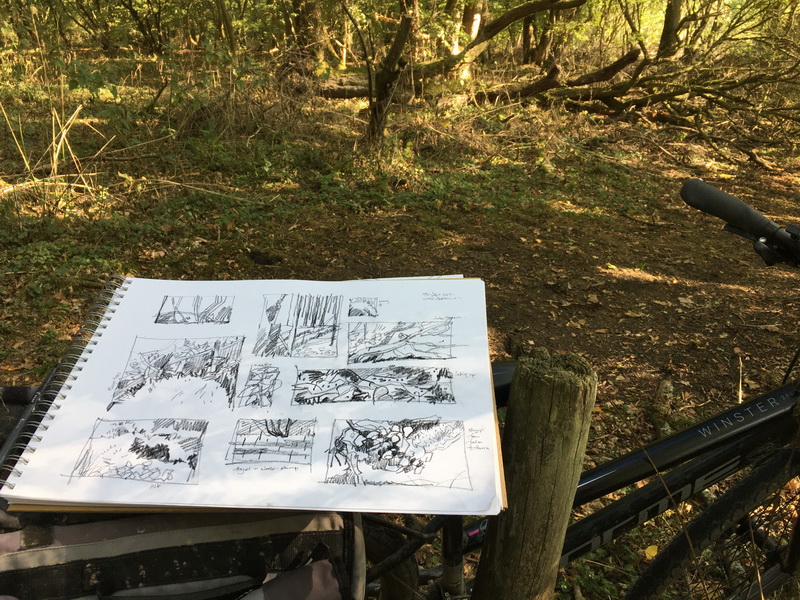
Following on from the sketches in the wood I needed to try out some possible colour combinations for next weeks printmaking.
Greens and blues for undergrowth, the water of the reservoir, deep russets and reds for dark shadows and fallen leaves, white flashes for birds and insects which catch the light as they fly through the dappled canopy, dragonflies in iridescent blue, red berries and cerulean sky blues.First some sketchbook notes.
I am trying to keep the palette limited which will make the printing more interesting and hopefully harmonious.


Then some small approx A5 trial prints using some of the colours.


Limited palette overprintings with colour notes: For once I have actually made a note of the colours on the test pieces. My working practise is improving!


 I
I
t will be interesting to see what will happen when I start to interpret the sketches and colours on a larger scale. Maybe something completely different, but that is just one of the unexpected joys of printmaking!
I was just thinking how incredibly hard you work – when you said your working practices are improving. I always admire, not just the quality of work, but how many paintings, drawings, sketchings and testings you achieve.
Ha Lucy ! you are very kind. and thankyou for your last comment too! I just wish I could get a few more things actually finalised!
In the middle of another set of tests right now..large scale printmaking this time. Life is just a delightful journey of exploration and discovery for me!