Florence 1

I took the little Florence sketch from the Staffordshire figurine in the Fitzwilliam and made 3 woodblocks to correspond with the 3 main tones and printed them… many times, just as an experiment.

florence n blocks

The results were very interesting. Nothing wonderful but enough to make me think this is a good way to work.

prints     IMG_7245
Some of the overprinted details are lovely and unexpected.The different colours and weights of colour change both the atmosphere of the image and her “look”.I also made a little watercolour of the figure, just to get to know her better. I have a weakness for china figurines. Strange smooth shiny little people, often “idealised” versions of real people or classical figures, in pastel colours often with painted features that do not quite follow the contours of the model.  Nice! More character and much more real in a way. Sometimes, people whose makeup has gone askew, look just like this!

flo 1 copy
I had a look at the real Florence Nightingale, who looked nothing like her china portrayal. The moon faced ideal of gentle Victorian beauty she was not, but a handsome, and uncompromising looking lady.

Cutting the Wood. Inevitable Dilemmas.

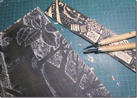
Cutting these blocks is challenging. In my new printmaking journey there have been only a few woodcuts, so I knew this would be a learning process. However I chose wood to match my subject. It is the most appropriate and sympathetic material for trying to catch the essence of trees and that’s my main aim.

I am using very basic ply wood so cutting it is tricky because, as with all media, it has its own qualities and drawbacks. Unlike wood engraving blocks or quality solid woodblocks, it chips easily, does not take fine details and has a mind of its own, sometimes taking the cut in a different direction to the knife and it snags horribly if the knife is not sharp.
The plus side is that it is easy to physically cut.
The most intimidating aspect though is the “when its gone, its gone” problem. One slip of the knife, one thoughtless cut cannot be easily rectified, so there has to be some planning. But over-planning and following a careful drawing can make for a still, formal image … very good for some subjects but not for my trees! They need life and character.

My tools are very simple. So far I have used 3 main cutters, 2 x V points and a U shaped gouge. I keep a trial cutting block on the desk to try out ideas for cuts.

I spend probably too long looking at the rough drawing, trying  to work out some basic lights and darks and the day slips by. Plans for careful cutting and planning go out of the window and I have to “ just do it”.
Sometimes that works, sometimes it doesn’t. At this stage, about half way through the series I have made the main cuts on 8 of the blocks. The plan then is to proof them and see what I have and how they work as a series. Then I will work on the details to adjust the tones and clean up the blocks. If I have cut away too much I will have to start again…angst levels are high.

roughs-

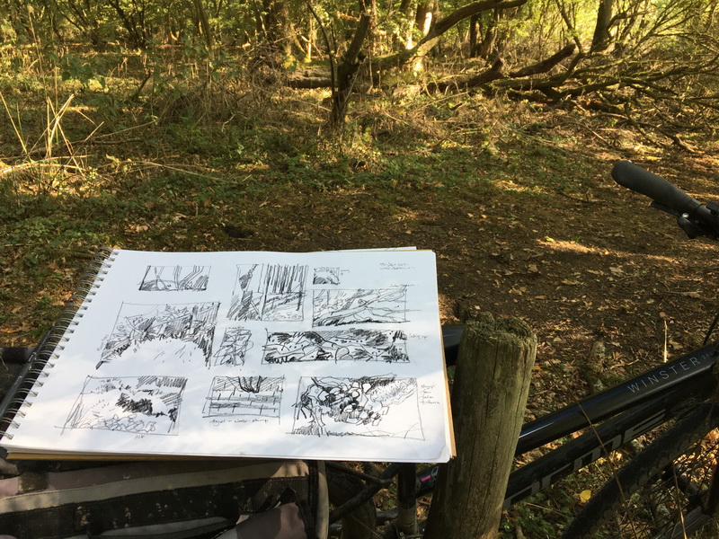
A pile of rough working drawings.

IMG_1881

And taking the block out again, this time to the field maples.There is nothing like working direct.

A series of anything are interesting to work with and I love the design stage. You need variety but also something to link the images, style, subject etc. This will be a simple  book with minimum text, so each turning page needs to bring some delight, something visually interesting, and intriguing, which makes you look forward to the next turn, each image adding something new to the “treeness” of the book.

Ideally the complete book, the paper, the binding,  the endpapers and the printing, will become a thing greater than the sum of its parts.
As I said, it is all a challenge and I am finding the fear of the pristine wood surface is even greater than that of blank white paper. I never thought I would find something more intimidating than that!

Block Cutting, Print Trials and more Sketching

This last week there has been more sketching, first print trials and block cutting for 12 Trees.It seems slow progress at the moment but there is so much prep to do before I can even start to cut the blocks, roughs to work out, blocks to cut and prepare and more sketching and research on the trees.
However I have started trial cutting the text headers today.

IMG_1715
Elder, Elm, Beech, some too big, some too small.
It’s trial and error.
What looks fine on the block sometimes doesn’t look great when printed and next to one of the large images.

IMG_1716
5 Part cut blocks..

More sketches while the weather is OK and there are a few leaves left.

IMG_1501
Field Maples,who seem to like to be in companionable threes.

IMG_1711(1)   IMG_1714(1)
Ash Trees with their upturned branch ends and handsome black buds.

Last Friday I started looking at type at Logan Press and hand setting a few lines, proofing on a lovely little Albion

IMG_1399     IMG_1401

IMG_1402

Slow .. but progress.

Branch Book 2 and some Goldfinch sketches

I am continuing to teach myself basic bookbinding and for this trial I printed all the Branch Book plates in a line and made a concertina book. It would work really well this way if I had actually made the original plates follow on a little better.. but for a quick trial it was fine and it was the binding I was most interested in. That, at least, is getting better.

branch-all

branch       branch-2

branch-3         branch-cover

The Branch title is slightly inset which was a small new success. Small new successes sustain me over the many mistakes…slow learning. Outside my workroom window is a small magnolia tree whose furry buds are getting ready to open. Yesterday a couple of goldfinches settled there for a while. Small flocks can always be seen by the waterside where the teasels grow and they love the seeds of knapweed which I (rather reluctantly) have in the garden for the bees. I keep meaning to make a print of these pretty birds so, at last, a few sketches. A print might follow in a couple of years … 🙂

gf-1       GF2

Goldfinch and Magnolia buds

Spotty Woodpeckers and the Fiery Redshank

Great Spotted Woodpecker  Dendrocopos major

I see the spotted woodpeckers often in the woods but we also have a couple that visit the birdfeeders here so it’s easy to watch them. They love peanuts.


Common Redshank  Tringa totanus

A pretty dainty little bird I saw pecking about by the shoreline. I did get a hazy shot this but it is easy to ID because of its brilliant red legs.

As it flew away catching the sun, it looked as though it was on fire. Very beautiful.


Thumbnail of fiery Redshank

It’s those sort of thoughts that make me want to record and note things visually. Not in a conventional accurate drawing but just as a record of what I have been thinking about, what characteristic I find interesting, maybe a colour, a shape, a line or an attempt to understand how something works.
Sometimes it might develop into print or a very detailed painting or even something 3D. Thumbnails are very useful !

Bird Week

Birds are so much a part of my daily life, both in the garden and on walks or cycle rides and here, in the winter, we are lucky to have some extra bird visitors on the reservoir.
So on Saturday I went to look for the Great Northern Divers who have been around for a few weeks now and ..hurrahhh… I did get to see one and in close up too, thanks to a very kind man who set up a telescope for me. I watched it preen and rise up from the water spreading its wings, dive and reappear. It’s a beautiful thing.

As well as the diver there were tufted ducks, goldeneyes, pretty teal, many, many grebes with apparently the red necked grebe amongst them. Up in the woods I have recently watched the tiny gold crests, the buzzard, the spotty woodpeckers, and  bullfinches, as well as the usual crows, mallards, swans and coot, moorhens, fieldfares etc etc nearer the shoreline.
So this week I decided to make a record of some of them in some sketches, in between struggling with prints and books. They may find their way into prints etc.

Tufted Ducks  Aythya fuligula
First up is the tufted duck which I see every year in the winter.

tuftys

A small section of the large flotilla of Tufties on the reservoir, their crests being blown backwards into little points turning them into slightly punk-y ducks.They look like little toys, all facing the same way, their heads turned away from the strong head wind, which I was cycling into.

tuffties 22
Pencil sketching to get a sense of the shape

tufftys1
Brush and watercolour only,  for a bit of discipline


tufty-bg2
They have very bright yellow eyes and a beautifully curved smiling beak.


They are delightfully smart and very graphic. According to the RSPB some are resident but others are winter visitors from Iceland or Northern Europe.
See more on the RSPB site here

In The Woods. Some Useful Sketches

The ancient oaks in Savages Spinney are just beginning to lose their leaves and they are looking magnificent. Their turning leaves are gleaming copper in the low sun, their long black branches twisting and snaking away from their massive trunks.

IMG_5187         IMG_5349

I often think about these branches. Their gestures are those of reaching out, of continually seeking something that lies away from their centre. They grow out and out until gravity defeats them, leaving rips, cracks and fissures.  Sometimes contorted dead branches remain silhouetted against the sky, sinister in their way.
But the Tree itself carries on despite these catastrophes.
I have to admit to having tree envy.

tree2    tree1    tree-3

tree4    tree5    tree-6

tree-7     tree8     tree9
Oaks in Savages Spinney: A3 Ink sketches
Oaks fascinate me, they did in Florida.
A little Live Oak leaf was my first Leaf of the Day back in 2008.
So when I walked up through the Spinney it seemed time to return to the woods for some drawing and sketches. They will be useful. Definitely some prints, maybe a book.
Don’t think you are escaping pigs though.. there are more to come. And of course they like acorns 🙂

It’s November…it’s Pig Month!

And it’s back to the sketching and the blog.

Leaving the academic world( probably briefly) regular sketching is back on the agenda. But I do like a purpose and this month it is pigs, pigs, glorious pigs.
In connection with Chris’ excellent “Salute the Pig” Blog I am going to be working on a series of pig prints and need to brush up on my sketching and get to know pigs a bit better. So on Saturday we went down to Franklins, our favourite farm/shop for their Open Day.

Their pigs are a delight, ranging from super cute little piglets to a magnificent Saddleback Boar. Loosely penned, very busy, very funny and very happy. Particularly because of the steady supply of apples which were coming their way.

Yes we eat pork, yes we know they are going to be killed, we are not starry eyed about it. But if we eat meat from animals which have had happy lives we do feel a bit better about it all.

pigs

Franklin’s Pigs. Sat 29th Oct So to get started, some Franklins pigs.

saddlebacks

Little snuggling Saddlebacks

pigs-2

Love those ears!! I also decided to collect the older pig drawings together in a Tumblr page here:  Pig and Pencil …yeah! Go pigs!

Other stuff: Medlars
It wont be all pigs. I am doing some observed drawings ( nice just to sit and simply draw something) and have set my Easton Group a monthly theme to work to during the winter break. Last month was “Harvest” I drew some medlars. The fruit with some delightfully rude names. It’s a very Anglo Saxon sort of fruit.

IMG_4725

IMG_4727

Curious things… I am bletting them ( hmmm) in order to make some medlar jelly. I wonder if pigs like medlars. More of these odd little things to come, their history is interesting.

I’m glad it’s Leap Year

The extra day is much needed. This week’s progress has been mixed, a frustrating letterpress session, some quite interesting research for the thesis and some trial seed drawings and prints to be made into small trial books.It is all rather small at the moment. Playing with shapes and colours and a few concertina book ideas.

arti     seeds-conc     foxglove


art     c3      c4


con2

Below left are the first proofs of the little linos for the seed book. It will be a very slim volume, only 10 pages, but just enough to create a book block or two, printing will be a mixture of hand printed lino, InDesign  printed text and them maybe some letterpress.

My biggest triumph is getting everything set up to print a small booklet. Below right are some of the finished pages. Text printed first on my very cheap Inkjet via InDesign then the linos hand printed.

seed-linos      linos

The letterpress didn’t work that well as we only use the proofing press for trials. Paper, pressure, inking etc all have such an effect and it’s hard to get good results to start with, but I am getting quicker at setting up the type.
Below some big numbers, a small amount of set text and inkjet printing

letterpress

I am managing to keep my lino printing clean now but not so the letterpress work. Everything seems to get smudged.Its mainly because I am unsure about exactly what I am doing and faff about a bit. Letterpress seems to respond best to firm and decisive actions and deft movements. It will all improve, I am sure ..:)

Some More Letters

More daily freehand letter forms for my October pen sketches.
They have been very useful in just understanding how letter forms are created, about the rules and then how rules are broken and bent.
Just as rules should be …

more-text

This second set includes some wonderful 60’s 70’s letterforms.The vibrant work, the visual track of my teens and early twenties and formative in my design thinking, really needs those incredible colours..more of that to come.

letters-4

It was interesting that while working on them I found these exuberant forms were the only ones that just would not be contained within the page. Some may recognise part of the “U&lc” Upper and Lower case mag logo.

ucm

Every gorgeous issue of Herb Lublin’s magazine was stuffed with wonderful design. I used to have a few.

And a few larger sketches from a great typographical “life class”.. Next month I am going to hopefully continue this daily exploration of type… but with some colour!