Growing Tips: 2

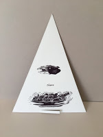
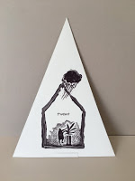
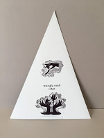
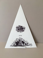
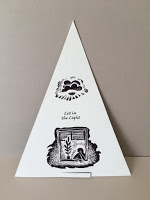
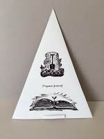
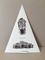
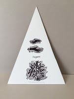
The word “Tip” has several meanings. The tip of something, advice in small chunks and to incline. So I decided, on the reverse of the lino plant tips, to make some small illustrated “tips” about how both humans and plants might flourish. We need very similar things really, plants and us; light, water, care, space, nourishment etc etc.


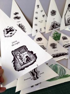
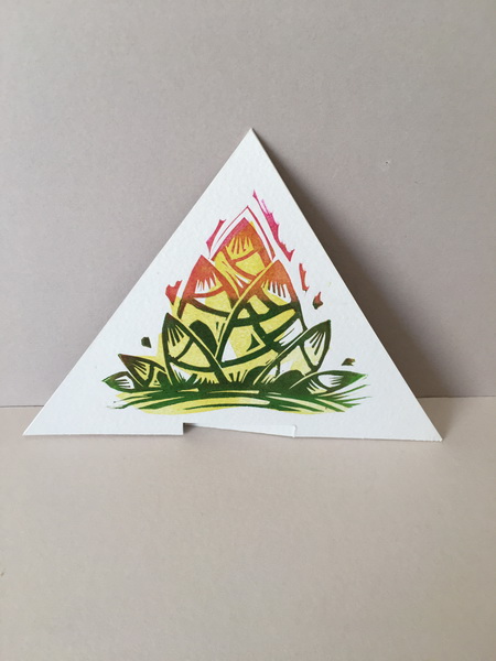
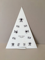
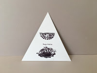
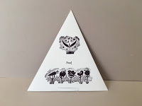
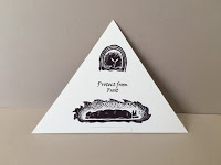
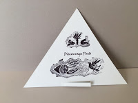
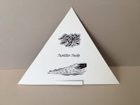
In any garden there are also pests and helpers.. as there are in human life too! So these had to be added. 🙂


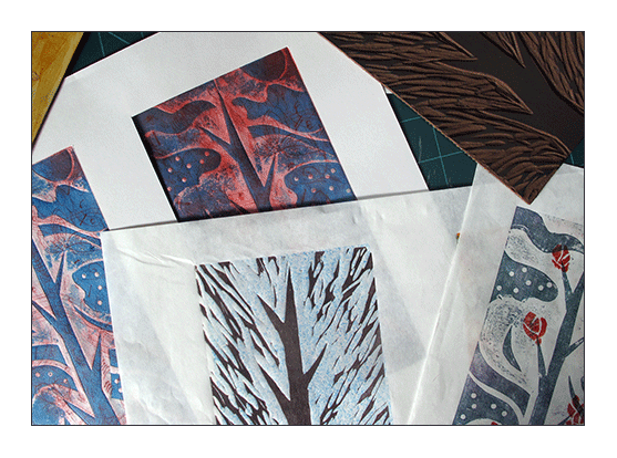
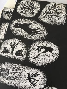
The reverse side illustrations were done on scraperboard and scanned and printed alongside the type. It was very simple in one way but the construction was not so easy. I tried different card weights and stocks, printing on different papers and trying adhesives until I had a compromise which worked well.

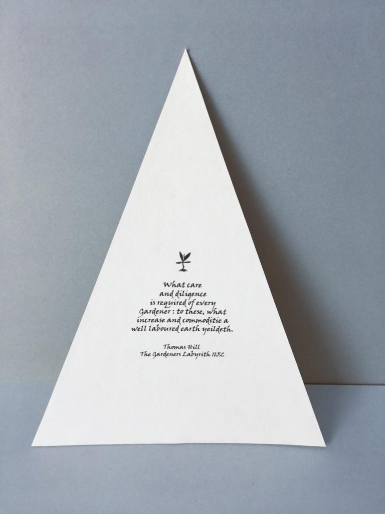
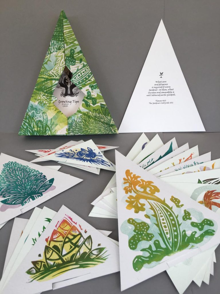
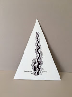
The text for the first page of the tips is from the wonderful Gardeners Labyrinth by Thomas Hill 1653. A very favourite old gardening text book of mine.

“What care and diligence is required of every gardener: To these what increase and commoditie a well laboured earth yeildeth”

How very true...A little TLC goes such a long way with both plants and people.

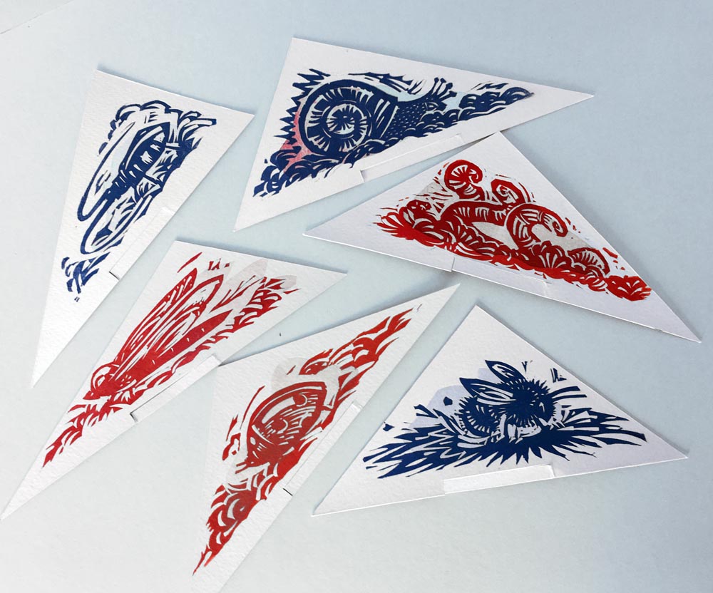
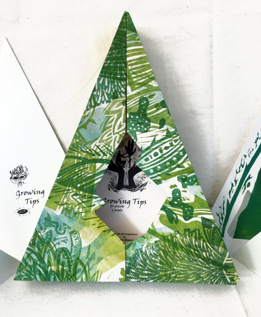
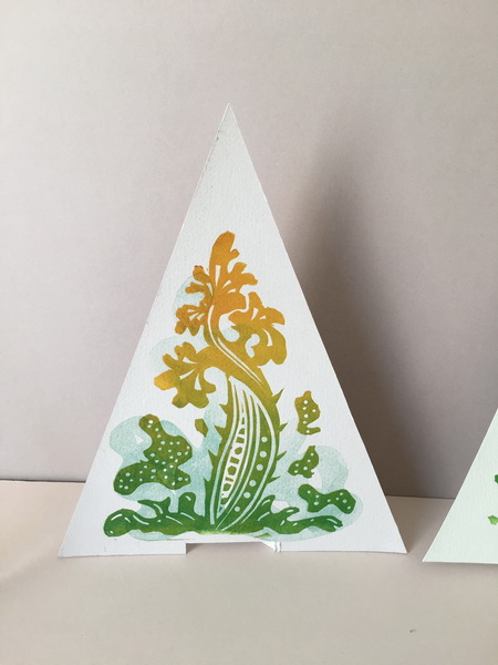
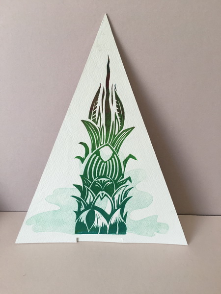
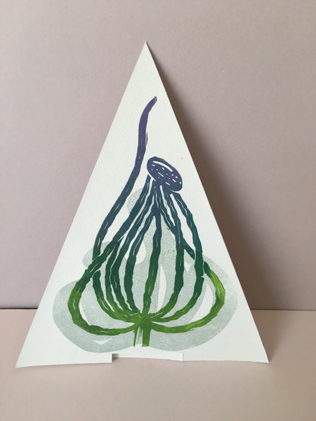
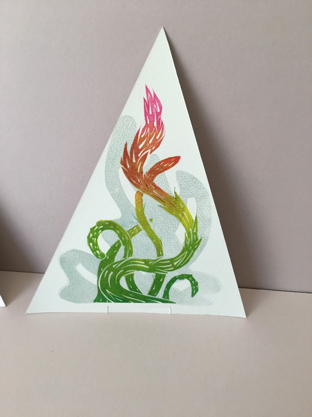
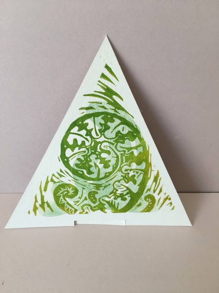
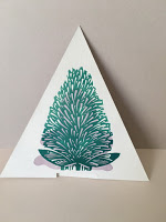
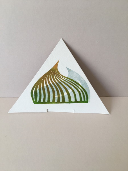
I printed the linos on 300 gsm watercolour paper and the text and illustrations on a medium weight photo quality computer paper. Then laminated these onto the lino tips which gave them enough strength to enable them to stand up once the small stand slots were cut in the base.
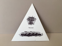
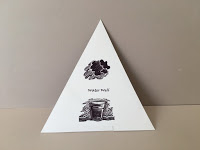
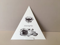
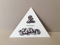
Growing Tips

I printed lots of papers to cover the box. The trickiest bit was getting the points of the cover to meet nicely at the top of the triangle. But it closes fine and quite neatly, allowing the title to be seen through the front aperture. The inside of the box is yellow…. nice!

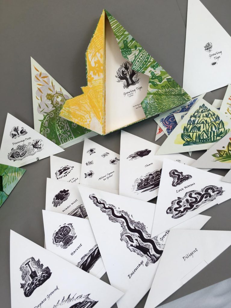
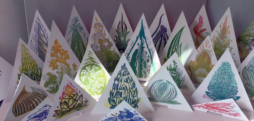
Here is a gallery of the tips and their “tips” 🙂


One project resolved…. about 50 more to go. The list of projects I want to do gets longer as the time I have gets shorter ! Oh so MUCH to do!

Again I have to thank Sue Doggett at City Lit boookbinding for advice and encouragement! She did say that a triangular box would be tricky.. she was right!


Pig Progress and Florence 2

PIG PROGRESS:
There is so much going on right now, but in between the prints and drawings and learning a bit more bookbinding, I am working on the pigs. More 3D ceramics ones this time. I had experimented with some 3D shapes over a year ago and have been wondering how to decorate them. On my recent trips to the Fitzwilliam Museum I had looked at the wonderful old English decorated and sprigged saltware, which at last sparked some ideas.
My skills don’t quite run to sprigging yet, so my first pigs ( of what will hopefully be a series, called “The Well-Fed Pigs”) are just black and white scraffito. I thought it would be rather nice to pattern them with all their favourite foods, “well fed”, in both quality and volume. More, many more perhaps, to come!

LWpigs

Sketches and notes for “The Well Fed Pigs” and a couple of trial pieces. I like them!

FLORENCE 2:
This autumn I decided to try to bring more ideas and experiments to some sort of resolution. I find it impossible to say “finished” but at least something other than files and folders of random sheets.So I made a small folder (good bookbinding practise) for the Florence prints and mounted them on folded sheets. It is a much nicer way of storing these colour woodcut experiments and they looked  much improved for a bit of care and attention

IMG_7353. IMG_7346IMG_7345.

A New Year and A Wolf Moon

What could be better than to start this New Year with a magnificent Wolf Moon. It’s the first full moon in January, so called because wolves are thought to howl louder at this time of the year. Not only is it a full moon, it’s also a supermoon. I woke up at 12 midnight to see my workroom flooded with moonlight casting shadows of the trees on the door and walls.
So, to celebrate, 2 monoprint moons from my Moon book, still waiting to be bound. Maybe this year!Happy New Year!

dogfrunning moon f

Autumn Jess

Sometimes I would really like to get another dog. A few days ago I saw a lovely brindled whippet/cross scampering about in the woods.
I could not help thinking on my late, much loved lurcher Jessie who I drew and painted so often.So just for the sheer love of her and of course of a bit more printmaking practise I made a small print. I liked doing this so much that I plan a few more Jessie tributes. It’s a two plate lino printed with blend rolls on Japanese paper.

IMG_1668    jess

Jessie sleeping amongst falling autumn oak leaves. image 16 x 11cms

Prints, Prints and more Prints

After the very enjoyable experience with the large print earlier this month I have started taking a closer look at the possibilities of overlaying prints and combining plates. I have made overlays before, sometimes just out of curiosity or even by mistake.

Now I am beginning to find the potential more intriguing, especially where I can combine different types of print: relief and intaglio, monoprint, wood and card or lino etc etc. the combinations are endless but I think this may be a way forward for me. There are technical problems. Plate heights to deal with, ink and paper issues and having the patience to LET THINGS DRY.
Curbing my enthusiasm and impatience is sometimes very hard.

They are getting bigger too. A2 is actually beginning to seem a bit small!

a2 print overlays

A2 woodcuts ( from the big print) combined with added shapes. Up on the path in the woods the autumn Arum berries are a bright note in amongst the dark tree cover. The woodblocks were made with this walk very much in mind.

Val L 3. Overprint trials_resize

A3 prints combining relief and intaglio blocks.
linos

A4 Trials

path-1path-2

A2 Plates. Wood lino and card plates.

They are loosely based on what I am seeing on the path at the moment, dappled light, twigs, stones, leaves etc I like these.They are an interesting development.  For me they need more consideration in the way of content and composition etc etc.. and of course then there is the issue of colour.. Hmmmm… way to go.

Bird Cherry Update

Back in 2015 I started experimenting with prints based around the Bird Cherry tree in the garden. I intended to make one print for each month to chart the changes. It was more a way of experimenting with techniques than actually producing a thing, and as with many projects, this one got overtaken by other work.

These are the first few proofs for possible January and February images. They are all based around one twig of this thorny little tree which I am not so keen on but the birds (yes, the clue is in the name) do love…and so do the bees, so it has to stay. Currently I am trying to improve my bookbinding skills and am attending a short course with the excellent Sue Doggett at City Lit.
Knowing we were going to be looking at Japanese stab binding on Monday galvanised me into picking up this almost forgotten project. Going back to the prints made me realise how much my understanding of printmaking has improved but there was no time to remake the prints, just to finish the last 3 months..oh and the cover and the endpapers and the text .. etc etc.

bcherryset

The full set of Bird Cherry prints, all printed on Japanese paper. The print size is  20 cm x 10 cm.

They are mostly collagraphs with the odd lino and woodcut thrown in. They are printed on Japanese paper, trimmed and tipped in. My printing is still rather erratic so this seemed to be the best way to get a decent set.

bcherry-1

Tipped in prints and a text page.

text-print-and-end

Text, endpaper and January print.

The text is also printed on Japanese paper, for its lovely translucent quality. The image pages are French folded Japanese paper, so bound on the unfolded edge and the end papers were made from a spare plate I had made as a background for another project.
The great thing about working with a professional is that you get to do things correctly and are shown things that suddenly open up a whole bunch of other possibilities. I have done some simple Japanese binding before but never added these very neat little corner pieces.

corners

or made an internal binding to hold the pages together before the final binding.

int-binding

The cover was printed with the same thorny image as the endpapers, thorns are very apt for this tree, and laminated onto thin card, I agonised about the reverse of the cover but the card was dark grey and smooth and looked too dull against the textures and colours of the prints and other papers, so I laminated that too with plain Japanese paper. Much better.
The cover title was set into a recessed rectangle and then everything was punched to make a classic 4 hole stab binding and bound with olive green hemp string I happened to have. NIce!

recess book

Bird Cherry: 12 Calendar Prints of the Bird Cherry: Prunus padus:   25 pages, tipped in hand printed plates, hand printed cover and endpapers. 225 x 290 mm. Hand bound.

title

Translucent endpaper.

april
Print for April when this little tree is covered in white blossom before the leaves appear.

I had allowed for the binding in the page size so this book opens pretty well. It is one of the drawbacks of this binding that it cannot open entirely flat, but if the pages are big enough and the paper flexible it works OK. Yes I am pleased.. and relieved to actually get something finalised.

Pig Print… “Number 1. Dottie the Gloucester Old Spot”

As you may know I am working, intermittently, on a series of pig images. This is “No1” a Woodcut, based again on the lovely Dottie from Old Weston Garden Farm.

dotty-woodcut
Dottie woodcut; Image A4

Gloucester Old Spots are gentle and good natured and were known as the Orchard or Cottagers pig. How this delightful and smiling pig must have brightened the day of the smallholder and to all accounts still does.

Lop eared with large black patches and a smiling upturned snout they are one of those charming “picturebook” pigs depicted as lazing in sunlit orchards and I do like the old wives tale that the spots developed from the bruises of falling apples. They are good mothers.. here are a few of Dottie’s piglets. Ahhh uber cute!

dotties piglets
Photo from Old Weston Garden Farm Facebook page.

Lots and lots more info on the Gloucester Old Spot HERE  from Chris’ Salute the Pig blog

IMG_0460
Working Drawings

dottie-proof
First Proof

dottie-block

Block

prints
First Prints
These are really first trials for the image. I am intending to make another smaller print in lino of Dottie for the book which I hope, in part, to hand print.
But I love the chunky properties of woodcut.They compliment the chunkiness of pigs I think. Something I would hope to retain in the lino version. Will be interesting to see the comparison.

Bird Hide

Another small experimental book about the Spinney. This little book describes part of my route through the wood where the old oaks grow. Part way along the track are the remains of a fence, once for some limited purpose as there was only ever one strand of wire, now missing in parts. It’s another remnant of some other time, rather like the old oak trees.

BH1      BH9

Initially I planned this as just a dense, tree filled, background with the fence, but as I worked on the block I thought it more apt to incorporate bird shapes “hidden” in the background. I am acutely aware that the wood is full of watchers, birds, squirrels and even perhaps the trees. You are never alone in a wood .. are you ? Also along the route there are signs to the Savages Spinney Bird Hide.

BH7

First rough design based on my sketchbook drawing

Adding the reference to the nearby Bird Hide by the water seemed apt. Who is watching who I wonder?? So should anyone care to take time to look into the image, there are 16 birds worked into the background, some a little abstract but then how difficult is it sometimes to see the inhabitants in a wood?

BH2           BH4

Two flying birds on the fold and the walking figure at the very end of the book.

The concertina form is joined by a thread of “wire” kept in place by two small twigs from the oak trees and is backed with linen, like the old maps which had that very satisfying strength and pliability. The covers are hard and quite weighty and the whole thing folds very nicely.. It is all hand printed so has a tactile surface so much more pleasing than the digital print.

BH3

It’s a very satisfying thing to hold in your hand too, that is so important for a book.

It’s not often I am pleased, but, despite the many things that could be improved,  I like this little book very much.
It has taken a few weeks to work out and I have more prints to play with,  but at least one is actually finished.

BH8

Hurrah!!  I am managing to stick, in part, to my 2017 resolution of finishing things!
More finished things soon.

More print trials. Collagraphs this time..Hmmm

This week has been taken up with more print trials and thoughts about my cast of characters as well as some thesis reading.

I have only made a few proper intaglio printed collagraphs before, usually preferring to print card plates as relief prints. But there is much to love about the intaglio method especially in the hands of someone as outstanding as Katherine Jones. I attended her workshop this weekend which was a fascinating insight into her working methods.
Courses given by master printers are both inspirational and frustrating, because they make it all seem so simple.
It isn’t…it so SO isn’t! However the trials I made will be very useful and I am beginning to understand how I can combine printing methods to created the images and effects I want. There is much to learn. These are some trials from the weekend.

dk1    dk2

Fish are always a nice design-y subject to play with. These fish actually do have a special significance for the project.

fish

Two inkings of the same plate. This time a larger A3 plate.

2-prints

You can achieve some very beautiful, if accidental, effects.

detail

At the moment, every time I lift the paper away from the plate to reveal a print, it’s a complete surprise. If anything lovely happens it is purely accidental. Hopefully that will change and I will have a little more control. I carried on playing when I returned home and tried to make some systematic comparison plates using slightly different methods and materials Home trials with different inking

spiral

tree

Trials with different plates to compare marks and inking and surface.

redtree

But it’s messy! I am not yet sure about collagraphs. They are thirsty for ink, laborious to ink up, and very very messy. Or I should say I am very messy, despite gloves. Me, my clothes, the paper, the press and the house are all covered in ink.

The Characters
Then I am also beginning to think about the characters. They include 17th century explorers, botanists, gardeners, herbalists, doctors and apothecaries. The process you choose to use can really change how you approach the imagery. I am playing with ideas, with methods, scale and imagery to find out what might suit. In arty terms its called “visual language”!… Trialling a simple bold lino print of a face.No one in particular ..just a trial.

IMG_2613

2 figure sketches and accompanying linos as yet unprinted.

characs

They will hopefully appear in some guise next week….