Binding the Pigs!

I am really busy right now with a new small book project,  but also making some, albeit a bit slow, progress with the “Salute the Pig” books.
I have “assembled” one trial binding. I say “assembled” because it’s definitely trial and error and there are still some things to get right in the stitching and spine areas. But it is coming along. I printed the endpapers and cover designs some time ago:

IMG_2325

IMG_2340

Trotting trotters for the endpapers…

IMG_2398IMG_2400

Two halves of one very big pig for the cover….

IMG_2378IMG_2397

End papers pasted in….

IMG_2395

Cover assembled…

IMG_2412      IMG_2413

One book bound :)… only another 24 to go…AND…. Chris is working hard on the accompanying little recipe book. “A Feast of Pork”…

IMG_2447IMG_2446

All tried and tested here at home ….MMMMMMMM delicious !

Half the Hog: Part 2

Printing the Texts:
With the texts set, checked and the few changes made it was onto the press with them, locked up, positioned and ready to go.
Most of the pages have to be printed on both sides so it’s essential to have the dummy book to work from to make sure the pagination is right for the book.
Because of the thickness of the paper I decided to have three folded sections, rather than just two, so that the book sits nicely in its binding and does not gape open.

IMG_2181
The dummy pages pasted up with markupsfor positioning the text block on the press bed.

The paper grain is also essential to ascertain as the grain must run in the direction of the spine, again so that the book pages lie flat and fold much more easily. Both papers are Zerkall which print beautifully and complement each other very well.Another consideration when cutting the paper was the question of the deckles. To keep or not to keep.
We wanted to keep them, again as an addition to the whole tactile feel of the book. The cutting meant that some pages would have deckles and some not. Again, just part of the look of a special little book made with great care, by hand and with beautiful papers.

IMG_2167
Adjusting the packing on the press

Because the type block consists of a light fine type and a heavier type the pressure on the packing was adjusted to allow more pressure for the large titles and less for the lighter text. The titles are set in a gorgeous original 1927 Futura. The big letters have the odd little chip here and there which just add to the character of the printing and the book.

IMG_2220
The ‘Welsh’ text about to come off the press.

A day for the first sides to dry and then Thursday was finishing up the main texts.

IMG_2188

Not a mistake but deliberate overprinting  to check for correct and consistent positioning of each consecutive textspot on!

IMG_2187

Piles of printed texts with the trial page

IMG_2211

Dry texts in neat labelled piles.

Friday was our final day to print the title page, copyright  and some extra images on larger sheets.

IMG_2225IMG_2229

Chris printed the last few prints. This is his favourite, the Berkshire!
Behind him the other prints hanging up to dry.

IMG_2164

And of course after each day the wash up. A strangely enjoyable task which marks an end to a good days work, the Vandercook clean and ordered and ready for the next task.
We came home with beautifully wrapped ( by Thomas) brown paper packets.
All I have to do now is design and print endpapers, design covers. collate, stitch, bind and tip in the plates ! Phew….. way to go Val….

Half the Hog in Amsterdam: Part 1

Last week we were in Amsterdam to print the Pig Book, “Salute the Pig”. Its been a couple of years in the thinking stage, so it was very nice to see it at last become an almost reality.

I say almost because I now have to design end papers and cover and then bind them, but they are looking splendid. We had booked a week with the excellent  Thomas Gravemaker at LetterpressAmsterdam. 5 days is a very short time to print even this small book and if Thomas had not done the typesetting we probably wouldn’t have made it.

IMG_2170
4 of the texts tied up on the galley.

While Thomas was finishing the texts, I started printing the images from the mounted lino blocks. A little bit of extra shim was needed to get the block to just type high but they printed pretty well!

IMG_2118

The Berkshire block locked up on the bed of the Vandercook

Proofing each block is important because a letterpress press can pick up the odd raised cut mark so a little bit of remedial cutting was made on some of the blocks, Due to the large amount of black in these prints it was necessary to double ink each image.Which means running the inking rollers over the blocks once prior to the print run. After printing the tree book pages for 5 weeks my right arm must be getting stronger?

IMG_2124

The first rack of images..I am printing 30 of each for a book edition of 25 books. These plates will be trimmed by hand and then tipped in to the bound book.

Thomas finished the texts, then there was proofing and checking the texts again and again for spelling mistakes, spacings and incorrect letters. You think it is all OK and then you find another!

IMG_2130

Texts ready for proofreading.

By the end of Tuesday all the 300 plus plates were printed and we started on the book pages. We printed page 1 and page 24 first because these contain two small linocuts which will need to be dry before printing on the reverse.
Proofing the blocks,and printing the edition.

IMG_2138  .IMG_2146

Wednesday we started printing the texts!
Part Two tomorrow.

Tree Book Break and Pigs in Amsterdam

I printed the last text page of 12 Trees yesterday. Phew.. it was very tricky and time consuming, but all the text is now done!
I “just” have the 12 main images to print now but they will have to wait until I am back from Amsterdam where I am printing Chris’ “Salute the Pig” book with Thomas Gravemaker at Letterpress Amsterdam again.
I printed my Masters project, Hortus Medicus Seedbook with Thomas and so I know the results will be great.

IMG_2076
Proofs for the pig book

The book is a tribute to 10 favourite pig breeds with lino cuts and a short text by Chris. He is also preparing an accompanying recipe book, one dish per pig with a bit of extra info about these lovely animals.

I have cut the blocks and proofed them, made up a three section dummy for the pagination and a quick InDesign document as a guide to margins etc. However, letterpress printing, as I have learnt, in the last few weeks has certain constraints and so one has to be flexible about the design especially when hand setting the type.

IMG_2087 (Edited)
Part of the 3 section dummy pasted up with text and images.

As with the !2 Trees book we are just printing the body of the book. endpapers and binding will be done later.It will be a small edition of just 20 .. which I think is about all we can print in 5 days! It’s all so very different from pressing the print button on the computer.. and to be honest much more fun.
More from Amsterdam soon.I am also posting on Instagram now if you want to see some more snaps of pigs and trees and lovely type.You can find me here….@vallittlewood

12 Trees Book: More Printing

Day Four: Monday:

Today more printing of the name blocks. Having printed one side of the separate sheets we are onto the reverse. It is Monday and over the weekend I had managed to forget the position of the deckle. Rather crucial for the finished book.
Only 10 wrongly printed sheets, so could have been worse! Its just a matter of learning by mistakes but hey that’s printmaking.
Printing this way needs intense concentration as every sheet is hand fed. Every sheet has to be kept pristine and taken off the cylinder at the end of the impression very carefully to avoid getting ink on the deckles. Mostly I succeed. Positioning the paper exactly in the gripper…the right way up is the first potential pitfall:

IMG_2007

This one is just fine!  If wrongly positioned it will cause incorrect registration on the sheet, which then has a knock on effect on the subsequent printings.. not good.
Then comes the impression:

IMG_2010

Here the “Oak” print, still on the cylinder, block perfectly positioned on the print bed by Patrick and then perfectly printed by me (the easy bit). The press inks up the block as it goes which is the joy of it. There are 4 ink rollers.. and therefore 4 opportunities for ink to transfer to somewhere it shouldn’t be or for me to catch the edge of the paper in a moment of lost concentration. Hmmm.

Day 5 Tuesday

A bit of a slow day due to a problem with some ink transferring to the paper from somewhere in the press. Fixed eventually by some dismantling and deep cleaning. But today we finished all the tree name plates. Hurrahhh

IMG_2013

Press being cleaned… slow job.

I am printing 25 copies of the book in the hopes of achieving 20 good ones. Each sheet will have to go through the press at least 4 times.  Keeping the sheets pristine is a challenge.At least 5 extra copies of each sheet are also printed as set up guides for the registration of the next element.

IMG_2011

These are my two working paper stacks. It is the whole of the edition plus the extra make ready sheets for positioning.

Day 5 Wednesday

Today we finished printing most of the small image blocks.
All the name blocks are done plus the small birds.

IMG_2015
The last name plate and small bird spot illustration.

Then the last small block, for the title page caused a headache due to the inconsistencies of the wood plate. The grain falls away slightly on one side which is a real pain. On the wood itself it is barely noticeable and I would not have known when cutting the ply. I might next time though!

Patrick has enormous patience in continuing to try various ways of adding packing, and re positioning the block to try to improve things. It will be fine, some things are hard won though.

IMG_2020
Patrick being very patient

Small strips of paper are put under the large block of low base to try to raise the low point just a millimetre. Trial and error is the only way. Tomorrow we will print it.

IMG_2016

My checklist of print runs completed.. almost half way.

Starting to Print 12 Trees

This week the printing of my 12 Trees book got underway.  I am printing the book at Logan Press with of course much help and guidance from everyone there, especially Patrick Roe, who owns the company, Tom who is an apprentice there and Bob the excellent compositor.
Before edition printing can start there is much to do in the way of testing paper, print quality, setting up the press etc etc. This takes quite a long time. Letterpress printing is not for the impatient.

IMG_1983

Firstly the plywood plates have to be made up to type high. Here Patrick  is setting up  a test plate using low base and small clips to hold the plates in place. Getting the correct printing pressure is a mix of packing the plate and packing the paper and a sprinkling of magic dust.
Because the plywood can vary very slightly each and every plate..30 in all… have to be both set up and printed individually.
 IMG_1984

The plate must also be positioned correctly on the press bed to print in exactly the right place on the paper… each and every time.

IMG_1986

Once the positioning and pressure were set up we made some test prints but found snags due to the length of the press bed, the roller, the positioning of the large plates on the page etc etc. We achieved a lovely print but the paper flipped up at the end of printing and caught on the block leaving marks on the margin of the paper. How frustrating!!  Everything else was perfect. We tried many ways round this but in the end the decision was made to print the large images separately. There are often compromises in letterpress printing. Sometimes that can lead to a better result…? I am hoping this will be the case.Day two was setting  up some test type and the tree name blocks to make sure the press could cope with the paper size, the position of the title blocks and texts and to see how the paper would print these two elements.  I am hoping to use lovely Somerset paper produced by St Cuthbert’s Mill in Somerset which has a soft matt surface which will complement the woodcuts perfectly.

IMG_1996

One of the tree name blocks set up for printing and

IMG_1988

Two lines of type set…

IMG_1989

then locked up in the chase with the help of Bob,
IMG_1990

and on the press bed perfectly positioned.

IMG_1991

One of the test prints on the Somerset which worked out beautifully. Day three, yesterday, we started to print the edition. This involves taking apart the dummy to get the correct pagination. The dummy is crucial as a guide as is page numbering!

Patrick set up the tree name blocks, looked after the individual packing and the press and I eventually took over the printing. I am printing 20 of each page hoping for an edition of 15 books, plus some extra sheets on cheaper paper for positioning the type/other images for the next print run.
Each piece of paper will go through the press 4 times so there are quite a few opportunities for error.. especially as I am doing some of the actual printing! Each sheet is hand fed through the press so concentration on the correct position of the paper in the gripper is essential.I calculated I printed 120 sheets yesterday ! …only 75 to go for the initial print run. Then do it all another three times, then print the large plates only, another 240 more impressions. After all that I will have the body of the books completed ! Hurrahh.Next it will be on to designing the endpapers, covers and then binding the edition..Phew… maybe they will be done by Xmas!


Block Cutting, Print Trials and more Sketching

This last week there has been more sketching, first print trials and block cutting for 12 Trees.It seems slow progress at the moment but there is so much prep to do before I can even start to cut the blocks, roughs to work out, blocks to cut and prepare and more sketching and research on the trees.
However I have started trial cutting the text headers today.

IMG_1715
Elder, Elm, Beech, some too big, some too small.
It’s trial and error.
What looks fine on the block sometimes doesn’t look great when printed and next to one of the large images.

IMG_1716
5 Part cut blocks..

More sketches while the weather is OK and there are a few leaves left.

IMG_1501
Field Maples,who seem to like to be in companionable threes.

IMG_1711(1)   IMG_1714(1)
Ash Trees with their upturned branch ends and handsome black buds.

Last Friday I started looking at type at Logan Press and hand setting a few lines, proofing on a lovely little Albion

IMG_1399     IMG_1401

IMG_1402

Slow .. but progress.

Hortus Medicus: The Seed Book

Seeds are on my minds right now. Every year I optimistically plant many seeds. Every year I try to improve our heavy clay soil and every year a few heroically struggle through.

This year I am doing it again. It is a classic example of the triumph of optimism over experience. Last year as part of my MA I did manage to coax some life out of some of the medical herb seeds I was working with. Henbane, datura, artemisia, celandine, foxglove, and strawberry sticks germinated, other did not. But I was encouraged enough to continue. One outcome of the work was the Hortus Medicus Seed Book. A small booklet which I printed in a week from start to finish in Amsterdam with the expert and essential  help of Thomas Gravemaker at Letterpress Amsterdam.

Just the printing was done with Thomas, the assembling I had to do at home which takes a long, long time and I realised I had not actually posted the finished booklet on the blog before.. so with seeds on my mind and in my hopes, here is the booklet.

sb-cover

HORTUS MEDICUS. A booklet detailing the dubious attributes of Seven Medicinal Herbs.

The work developed out of a visit to the Hortus Botanicus in Amsterdam where I met the then head gardener Hanneke Schreiber. We had discussed the origins of the garden which was originally set up in 1638 as a Hortus Medicus, a teaching garden for apothecaries in Amsterdam and both agreed that the most interesting herbs were those which were both beneficial and deadly. The 17th century was a heady time with old superstition and new science co-existing in both peoples minds and in writing. Irresistible to me. I decided to combine those two aspects in this little booklet which was really designed to be exercise in letterpress printing.

sb9

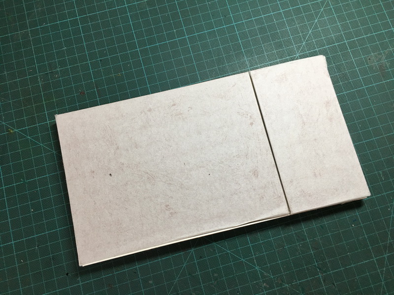
The blue slip cover was printed on both sides with the text “Hortus” and “Medicus” with nice big san serif wooden type.

sb5

I printed the small arrow and decoration on my Adana here at home after returning from Amsterdam.

sb6

The booklet cover is printed on both sides to echo the slip case.

sb8

On opening there is a small panel which contains a quote from the wonderful 16th Century botanist/physician Nicholas Monades.

sb1

“For it is a greate thing to know the secreates and marvailes of Herbes. I will make experience of them and I will know their vertues and operation. The Seedes we will sow at their due time to remedy the hurtes and deseases that we all do suffer and endure”

sb-spread

The inside spread shows 7 apothecary bottles, the names of the herbs spiral up in the fumes mixed with the red text which indicates warning and dangers. It was a tricky printing exercise. I hand drew the bottle shapes in an old fashioned way with photo stopout ( which reminded me of working on hand drawn colour separations many years ago) and prepared the fume texts in a very modern way with Illustrator. I worked on this overnight on my laptop in our AirB&B room in Amsterdam learning on the hoof really. Thankfully Thomas prepared a really accurate layout for us to work from on his Mac. That was just a bit beyond me!

The plates for fume text and shapes of the bottles were made with Thomas’ photopolymer machine and I hand set the herb texts for the bottle shapes in 10pt Garamond. It’s very small!

sb2

The herb texts were taken from some of the old herbals which I love so much; i.e. The juice of the Thorn apple boiled in hog’s grease cureth all inflammations whatsoever” .. Simple! What’s not to love!
Some are just bizarre and some have the element of truth. The foundations of our modern medicine based on trial and error and endless observations. Having whetted your appetite for planting these mysterious and dangerous plants, turn over again for the seeds themselves, nicely prepared for you on perforated seedsticks which you can just pop straight into the garden.

seed-sticks

Yes they are real seeds.. :)… but in the interest of public safety, not THE seeds.

sb10

We used some wavy brass line to signify the earth with the S indicating the root.

sb3

The final page has a small linocut I made of the gable stone attached to the printshop building which looks out on an adjacent  “secret” now unused passage. I just wanted to add something special to the booklet that was very specific to the location and to Amsterdam and as mysterious as the wonderful “herbes”.

sb4

It shows three fish and their baskets and is dated 1742.

sb12

Next to the gable stone image, the colophon etc. And we printed it in just a week. It was quite something and not possible without Thomas!

sb11      sb14

sb-cover

Hortus Medicus, by Valerie Littlewood. 4 page Booklet in slipcase. Letterpress printed. Folded size 380mm x 11mm ( 15.5 x 4.25 inches).. and with real seeds… My research into the whole subject of old herbals, superstition and bizarre texts and ideas was extensive and much of it still waiting to be developed into prints and booklets.

Recently I attended a symposium at Warwick University which covered many fascinating aspects of book production in Italy from 1570-1700’s. Chap books, broadsides, illustrated books, natural history books, alchemical  recipes, were all discussed.
So many ideas….if only I had more time!

After Amsterdam….

Three great weeks in August, some serious letterpress printing, lino cutting, cycling, fabulous museums and galleries, good food, drink and company.. and plans to return for even longer next year.
I will be putting some post s up about my time there, which if you are not a letterpress fan may look a bit dry. But my aim was to lean more about the capabilities, restrictions and potential for future projects.
I achieved all that and more thanks to the very excellent Thomas Gravemaker at LetterpressAmsterdam and the Vandercook.
More projects planned….. : )

And Another Hortus Book
Before starting the project with Thomas, there was by chance a short three day “Make a Book” course. ie cut linos, make etching plates, print them; hand set type,print it; bind book. Sounds fairly simple but is a huge amount to do in 3 days in a class. The course was run by Thomas, Carola Rombouts and Thekla Ahrens.
It was excellent. As I was in Amsterdam to print part of my Masters project it seemed appropriate to keep the theme going.
Just time for 5 of the 7 Janus herbs this time …
Simple imagery, typesetting and just 2 colours.

    book1

Proofs, wood and metal type, lino and stamps. And the finished book.


Covers …


Double spreads..

Simple, with super fast lino cutting, but many more techniques understood and learnt…Great ! More Amsterdam printy stuff soon. Just a couple of weeks to go and the course is up!

Easton Show, A Sideways Step into Print and a Big Blue Bee

I have said before, if the blog is quiet it’s because my life is not. How true. Just two weeks before our Easton Group Show and I am looking at the pile of “stuff”, sketches, prints, half started paintings. etc. What to do with all this?

easton 8

I have regarded this year as one of experimentation, I have researched, studied, thought and made many, many sketches and notes, more than I could ever put on the blog.
It’s been a year to meet other artists and share ideas and to explore some new directions.  It has been illuminating.

So for me the Easton Show will be a sort of marker, the end of one phase and the beginning of the next. With a very exciting solo show at Easton arranged for a years time, it’s on with forward planning and a few changes in what I do and how I work.

Letterpress, Print and Books

Number one on my list will be my delayed side step into printmaking.
I now have my lovely small Rollaco Press, my big old Cropper Charlton nipping press and a little old Adana housed in the garage and we are ready to go.

rollaco_resize

Rollaco Press with bee

nipping press_resize

The big old nipping press with my much prized Boxcar Press apron.

IMG_0002_resize

Adana poised and ready….

I had been exploring letterpress again when I was in Orlando with the very excellent guys at Mamas Sauce whose enthusiasm and dedication to all things printy was so inspiring.

mama sauce  mamas sauce

Mamas Sauce Printshop in Orlando

Although we are not there anymore I still keep up with what they are doing. See their site for some wonderful printmaking, links and videos. There will be planned returns to St Brides in London where I printed “Rook” …


block
St Brides Foundation London Print Museum and Courses.

And a hopeful trip to the USA to the fabulous Hamilton Wood Type and Printing Museum next year.

There will be making small books, inspirational prints and maybe a ranting broadside or two. So adventures with lino and the press started just this week with a very simple bee! (what else).
The huge new queen Bombus terrestris are out and about. They were my inspiration and  I may call her the “Easton Bee” in tribute!

bees s_resize

Many bees

bees 2_resize

And in other colours too!

Big Blue Bee for Easton

image

Image 6×4”reduction print on Hosho paper.

I really do intend ( Yes ..I do know all about hells road..but a girl has to try)  to get back to the blog with a perhaps a bit of a printy make over for that too.

I hope you will join me.