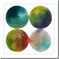
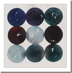
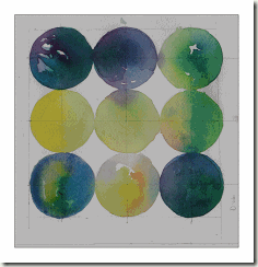
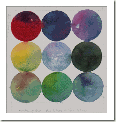
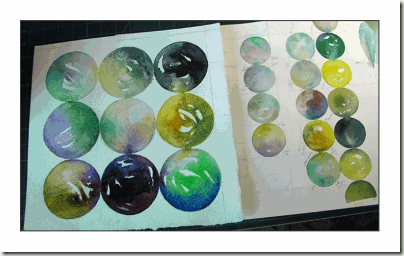
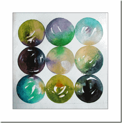
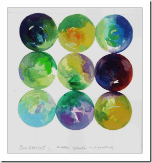
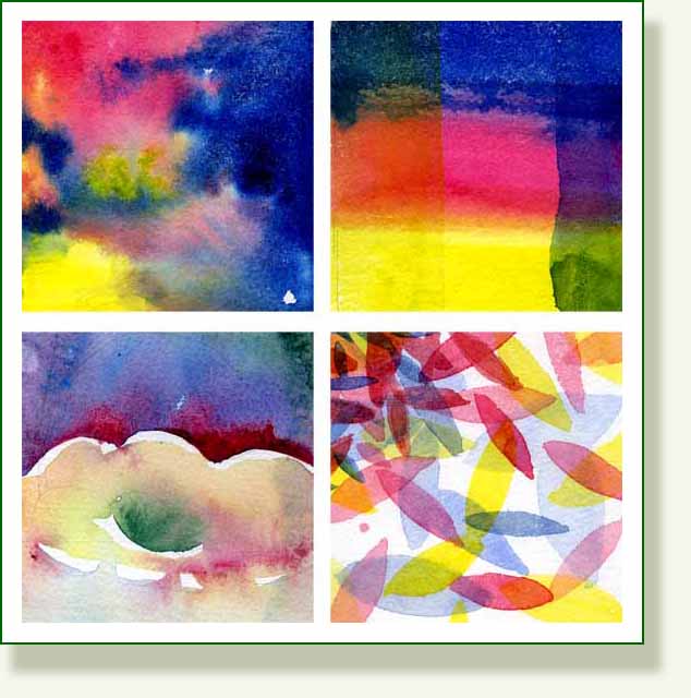
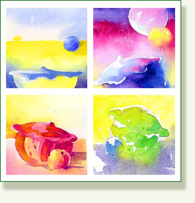
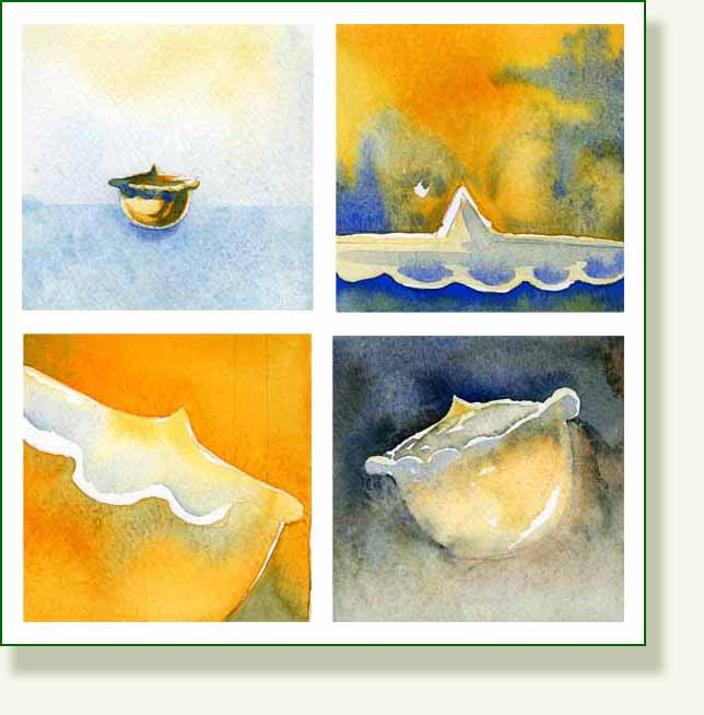
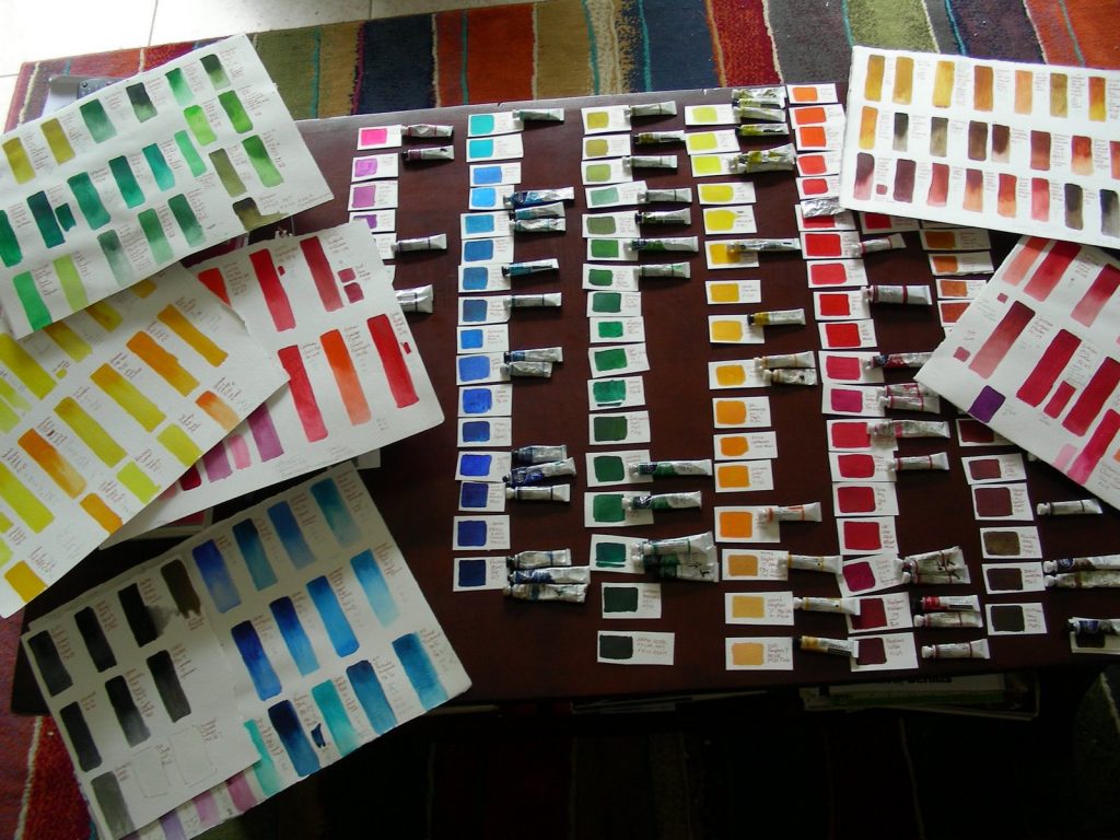
I have spent the best part of three days now going over colours and pigments again. I have been promising myself to make a chart of them and needed to devote some concentrated time to the job. Artists do this in order to understand more about the true nature of pigments and how they differ.The whole subject of colour history, its manufacture and use is fascinating. Having seen the Grand Canyon, considering the work of O’Keeffe, Hockney and the other painters of grand and colourful landscapes has made me think about colour again.
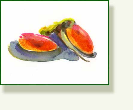
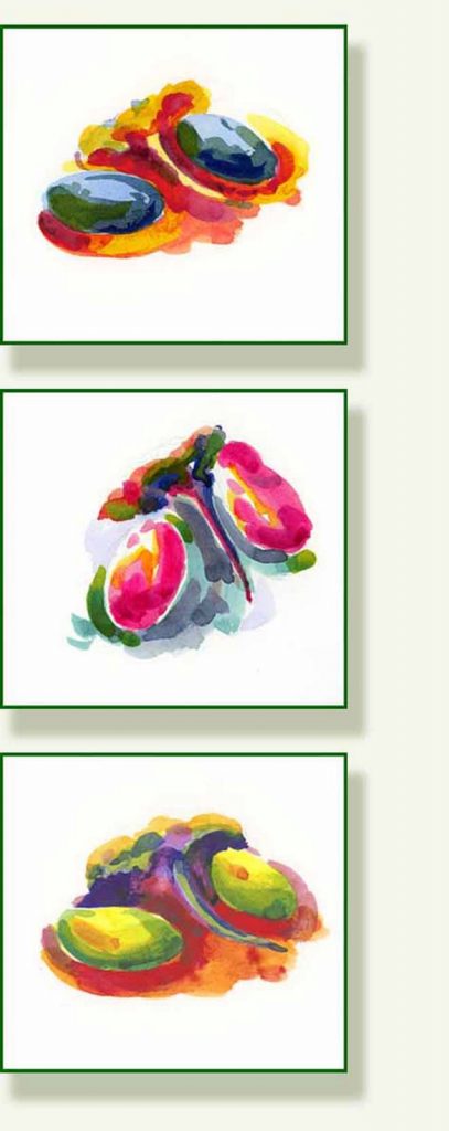
Also my recent course submission, (the floating flower heads here) came back with a query about the brilliance of the colours. But my current tutor, who is a botanical painter of the highest quality and whose work is stunning, did admit that it might be the fact he is looking at them in the duller light of the UK. I don’t want to defend my work particularly, but I know for a fact that when I had the flowers in my hand, my colours really were “pale imitations” and looking back I had noted here that my colours seemed woefully inadequate.
In this intense light even in my shaded studio room the colours, of the heliconia particularly, were positively fluorescent. So I ask myself, are Florida flowers themselves actually brighter than UK flowers? Perhaps they need to be, in a struggle to compete for attention in this dazzlingly dappled light which, by virtue of its brilliance, also casts deep shadows? Or is it the quality of light that makes them appear brighter? If I try to illustrate this with a photo on the Internet, the brilliance you see will depend on how your computer’s colours are set, so the perception of colour and light has yet another variable…
Looking at antique illustrations of tropical flowers whose colours are generally softer and duller than the actual flowers, one has to bear in mind that artists did not have the colours we have and many watercolours will have faded over time as the pigments were fugitive.
Even now there is a problem rendering a particular fuchsia colour accurately. The recently introduced colour Opera Rose was developed to try to help. It is a dyebased colour, as opposed to pigment based ( therefore not 100% light fast).

Winsor and Newton describe it thus:
Our new fluorescent pink/magenta is a step forward. Fluorescent pigments provide high key colour to match the flowers and buds of the many newer hybrid or tropical plants available to gardeners these days, but unfortunately the traditional pigments have been fugitive. Opera Rose however can now be supplied as moderately durable, equal in permanence to Alizarin Crimson, ( ie, a possible problem!) giving flower painters a wider choice of colour.
Fluorescent dye/resin based pigment; Quinacridone PR122B – Moderately Durable. Semi-Transparent
Colour and light are a constant problem for artists and it depends largely on what the artist is trying to achieve and the purpose of the art. Botanical illustration strives to render everything accurately, including colour, but even here, some painters chose a more subdued colour palette for reasons of personal taste or aesthetics, especially if intending to sell. After all many people are still very conservative about colour and don’t want that gaudy heliconia shouting at them from their walls, accurate or not.
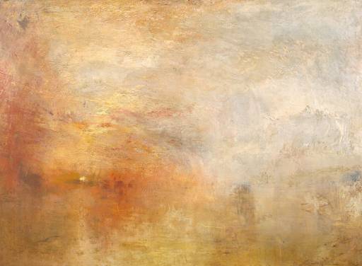
All this was reminding me of Turner and his joyous and extravagant attitude to new colours that were becoming available in the early 1800’s. In his excellent book “Bright Earth”, Phillip Ball describes how “the blazing works of Turner break through the brown crust of early nineteenth century convention“. Turners desire to paint the truth of the impression that (nature) leaves in the observer’s mind, rather than academic convention shocked and horrified the traditionalists.

No reproduction of any kind can do justice to Turner but this from the Tate Gallery website is just a reminder. “Sun setting over a Lake” 1840.
There is a particular passage in the book which is very interesting and illuminating, describing Turner’s own guerrilla tactics of providing shock and awe at the Royal Academy. On “varnishing days”, a few days before an opening, when painters were allowed to make last minute alterations, Turner transformed his canvases in situ to the acute dismay of his rival painters.
” Turner went from one to another of them on the varnishing days, piling on…all the brightest pigments he could lay his hands on, chromes, emerald green, vermillion, etc until they literally blazed with light and colour … Artists used to dread having their paintings hung next to his, saying that it was as bad as being hung beside an open window.
Ball goes on to point out that this was “An explicit confession by Turner’s contemporaries that their more conservative painting styles did not after all come close to capturing the glow of real daylight!”
Here I look out of my window and see the brilliant light bouncing off white walls, bright green foliage, iridescent dragonfly wings and vivid red flowers. The sky is sometimes Prussian blue not cerulean, there is viridian here and saturated magentas and bright orange. It is vastly different from the UK. Whether these are the colours the artist chooses to use though, is a different matter!.. This leads onto the Pre Raphaelite’s use of raw colour..more tomorrow.
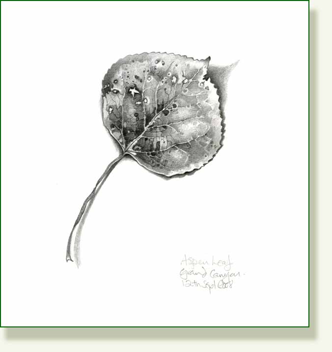
I did get the drawing of the aspen leaf done… it seems such a humble, small thing in comparison to Turners gorgeous canvases, but he did drawings too…
This little leaf is only just over 3 inches long, very similar in shape to the cottonwoods but with a more rounded profile and less pronounced serrations.
_______________________________________
 Aspen Leaf, Pencil


