Bees, A Sadly Missed Course and Catching up with Jobs

I am trying very hard not to be in the depths of gloom about the current situation. Having to stay at home now seems a terrible imposition when normally I would love a week or so without having to go anywhere. I am really hoping to shake off this sense of unease and throw myself into something creative soon.

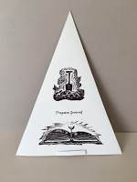
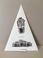
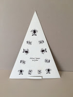
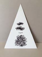
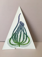
But I have been busy with a book jacket for a local author and the today the sun is shining, the birds are singing and the delightful Hairy Footed Flower bee males are zooming around the garden. They are also using the bee box as their overnight accommodation. There were three in residence yesterday, sheltering from a cold early morning wind. They are just waiting for the females to emerge so whiling away the hours sipping nectar, patrolling their patches of comfrey and pulmonaria and resting.

The little white nose of a HHFB peeping out from his overnight shelter.

This is a short clip of an early mining bee having a spruce up. I had found her on the path and moved her to safer ground.

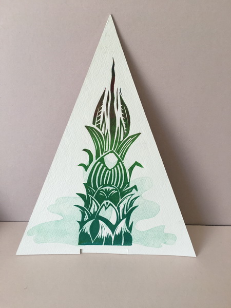
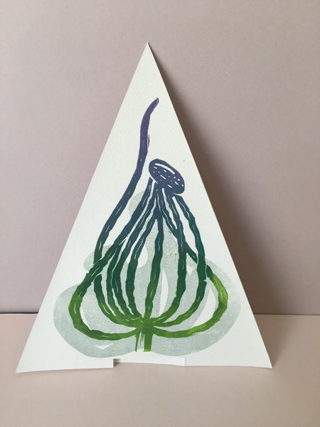
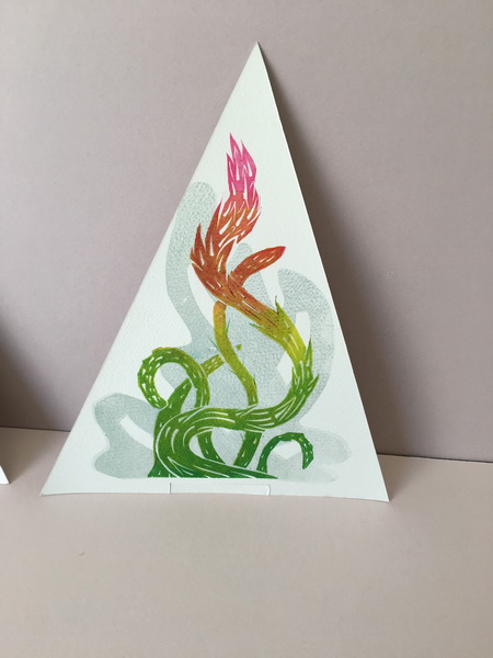
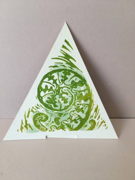
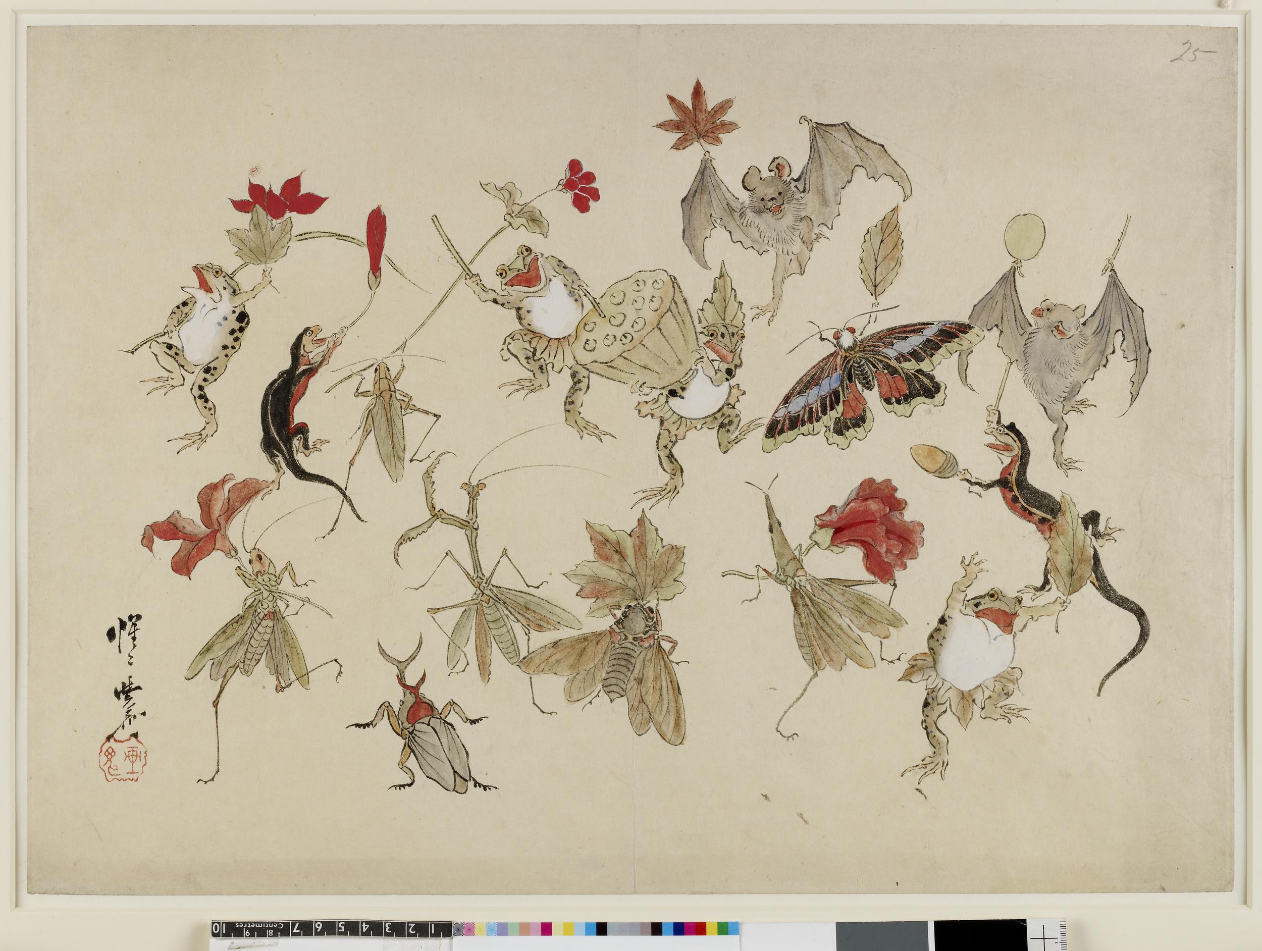
Meanwhile because of the virus Chris and I decided not to attend a couple of courses last weekend in London. His writing and mine a Japanese woodcut course at City Lit which I had been really looking forward to..oh sad sad..
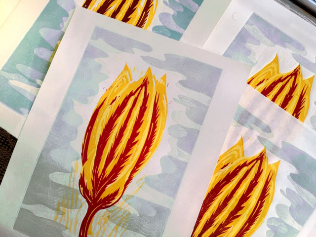
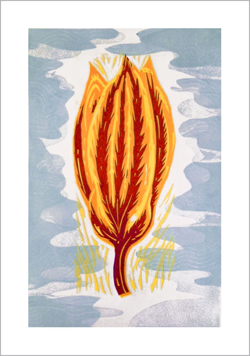
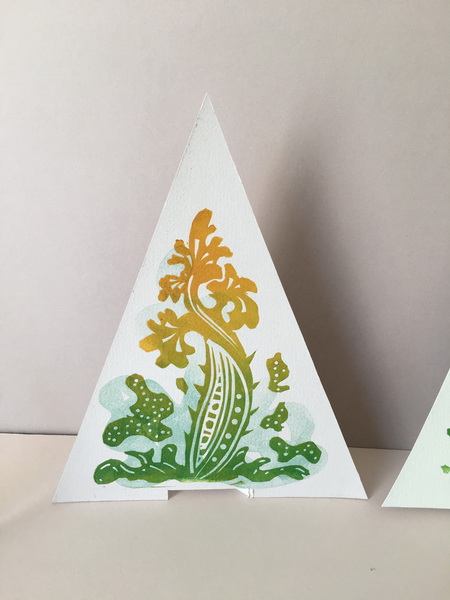
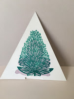
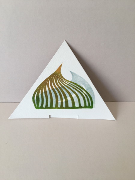
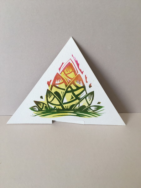
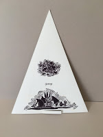
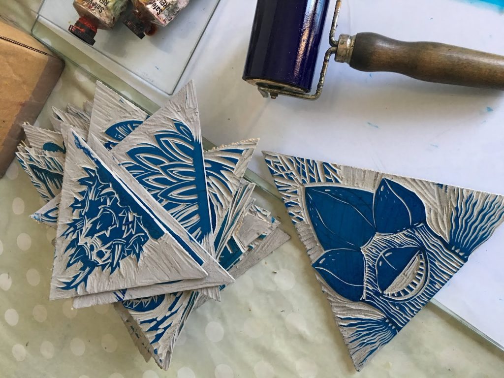
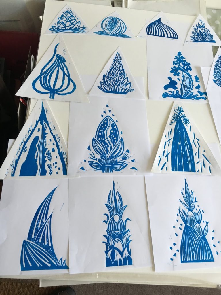
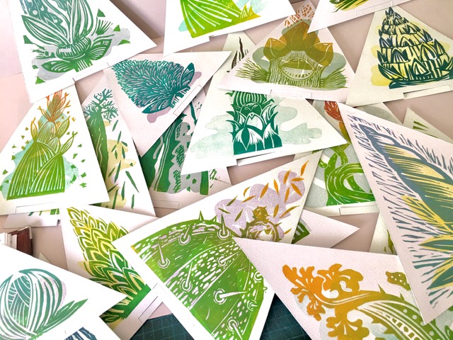
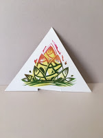
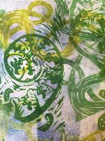
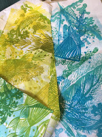
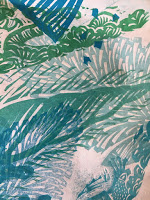
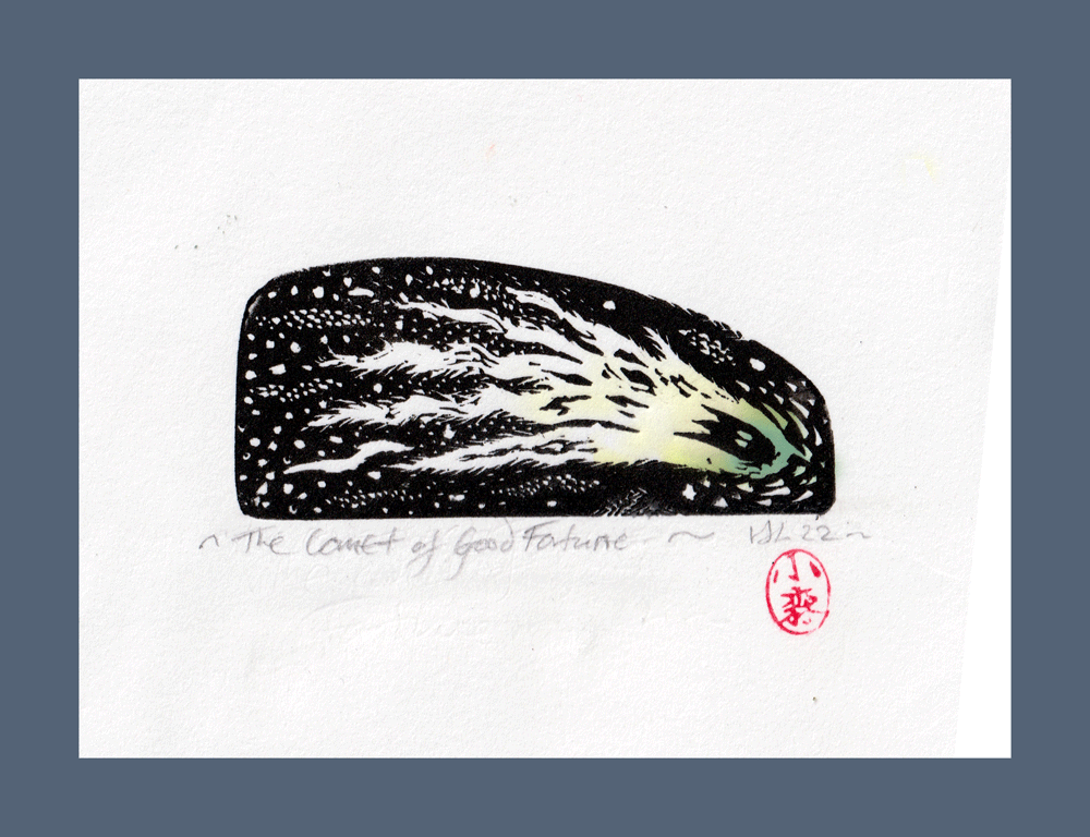
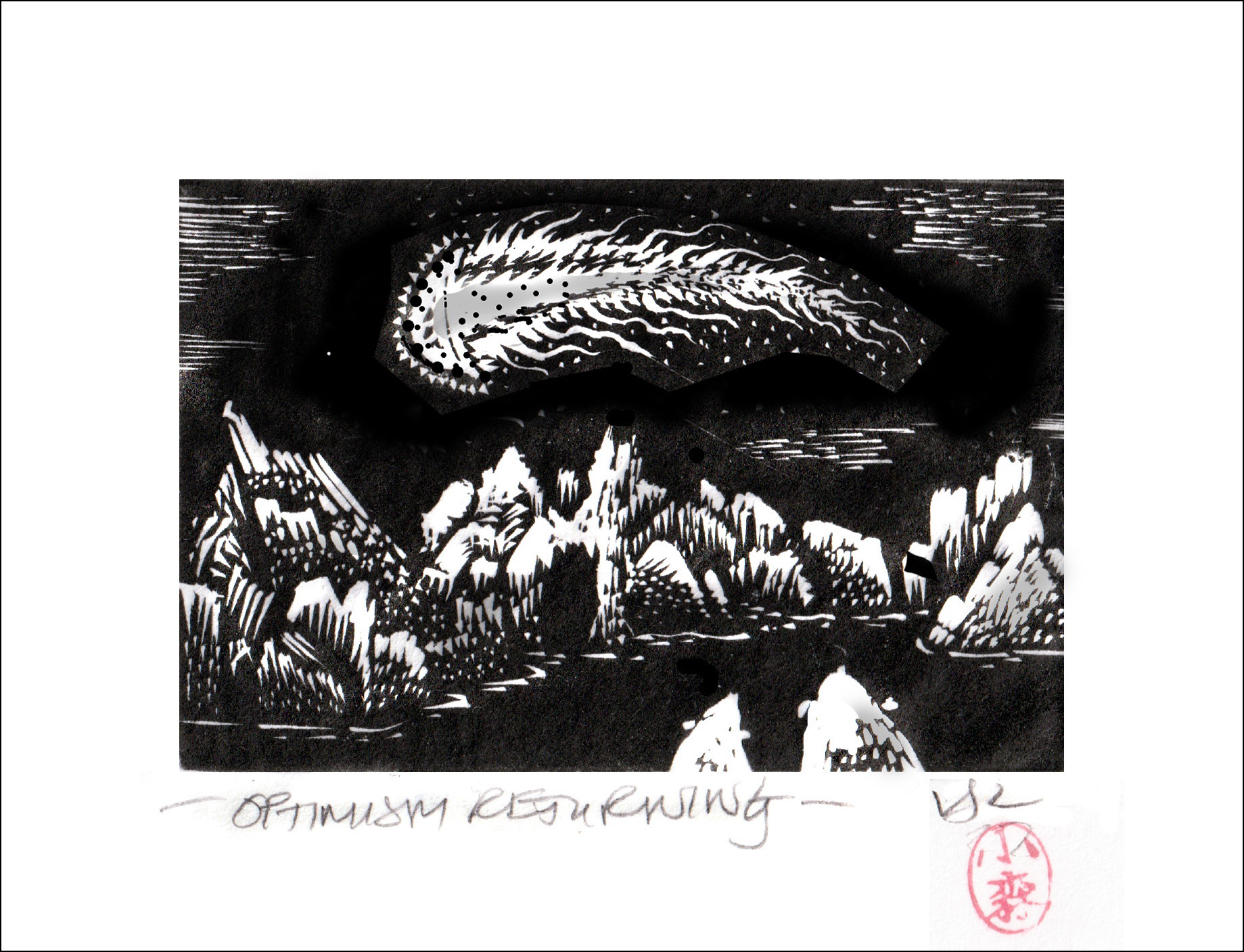
But in a spirit of solidarity I tried one at home following some guidelines from some old notes I had. Lots of problems and wrong turns, including poor cutting and inking and blobby prints but if you can get it right it is a beautiful technique.
Soft colours and water based.
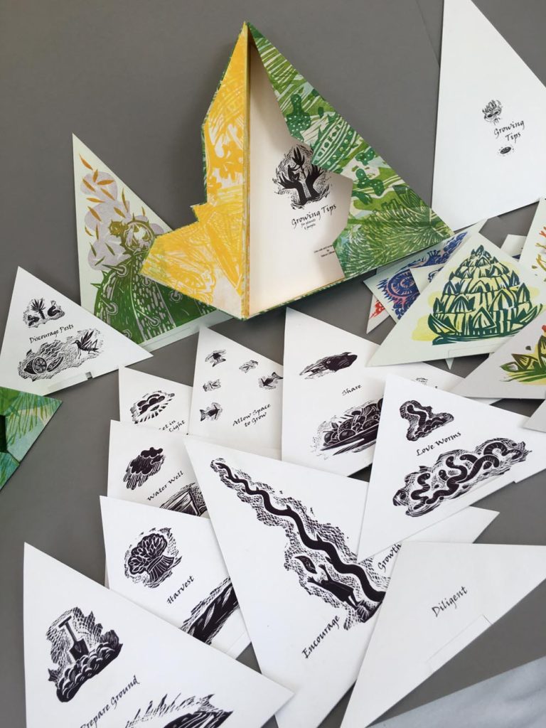
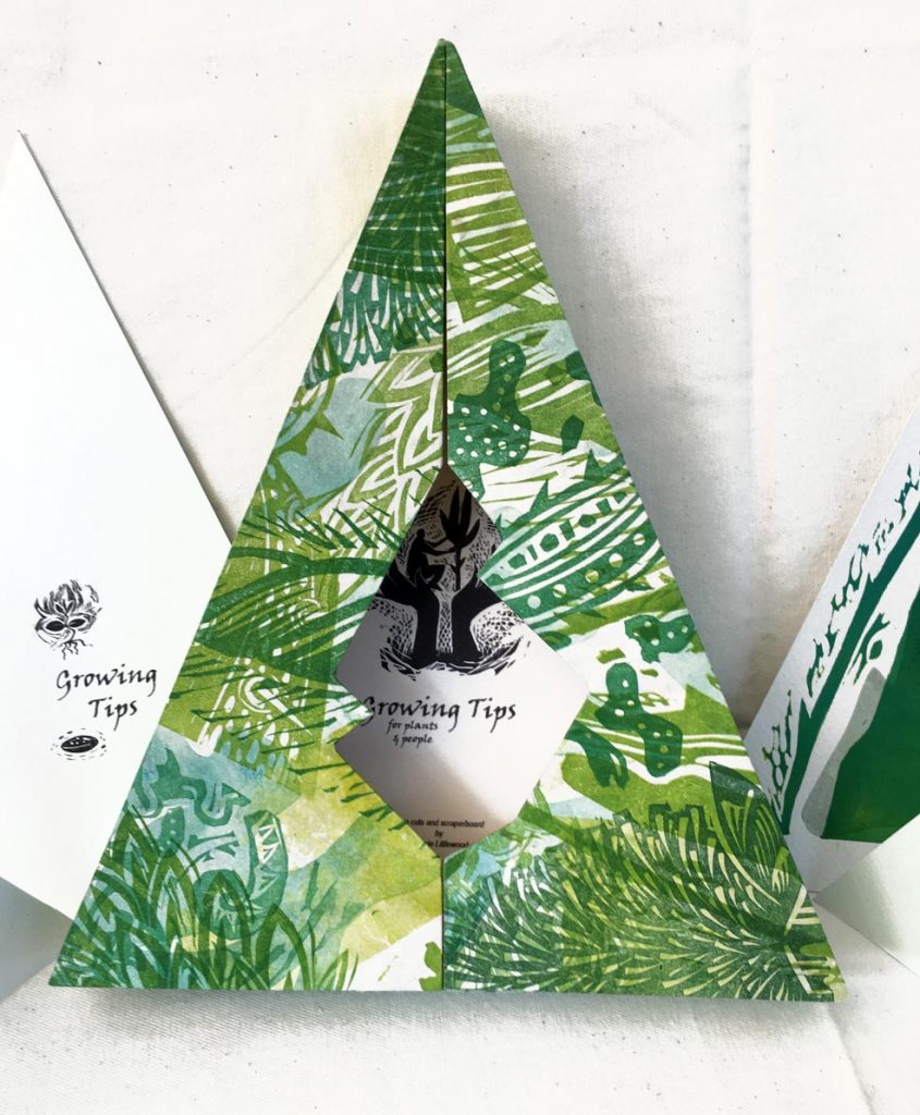
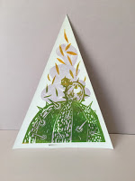
I hesitate to post these rather poor blocks and prints but it does show I have not just been twiddling my thumbs.


Trial of 4 colour woodblock print 

Then there are lots of jobs I could do in the house and garden….. I suppose… But all I want to do is GO OUT. 🙂

I hope you are all taking care of yourselves and no doubt putting me to shame by using your time wisely and productively!

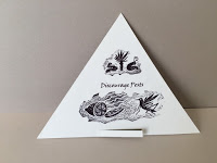
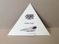
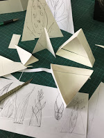
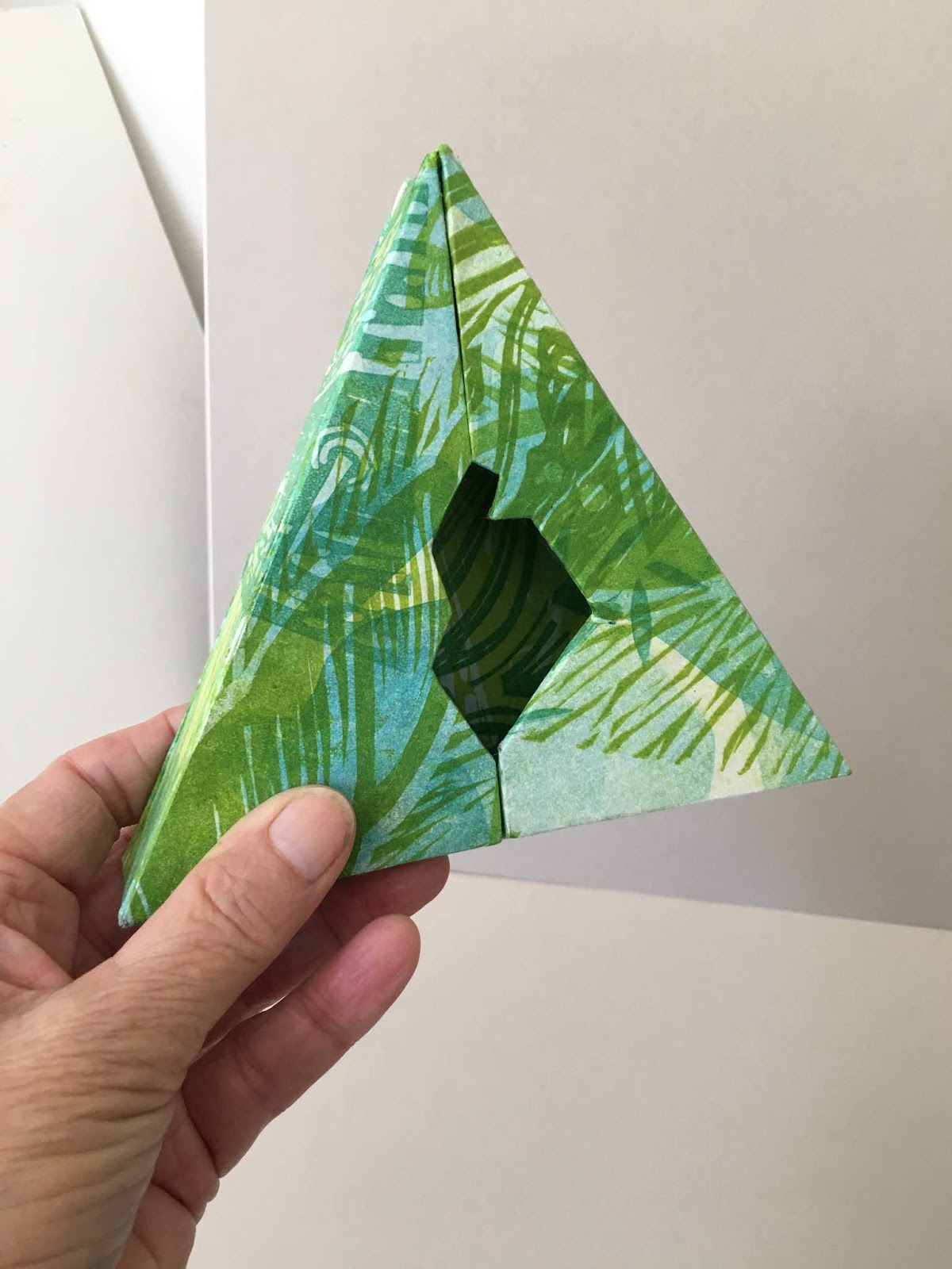
More about the bird book in the next post ….

The Colour of Birds : Drumleaf Book : Part 2

Having decided on the size of the book and making sure I could actually make it, I started on the artwork for the birds.

The birds will be printed on Japanese tissue, which will be tipped into the colour spreads.

A thumbnail design of how it will work in my sketchbook .

The birds I see around the reservoir here are a constant delight and wonder. But how to choose? Eventually I settled on: Swan, Rook, Jay, Owl, Green woodpecker, Moorhen, Heron, Robin, Pheasant and Blackbird.

I dithered a bit further about how to portray the birds. Should it be the conventional way of showing them in their entirety? Nice but a bit predictable and the title of the project is the “colour” of the birds. So I after a couple of trials I decided to zoom in on various parts of the bird where the particular colour I wanted to feature was located. To add some variety, for two spreads I took the birds away and replaced them with a feather and an egg. Beautiful colours in both cases.

I make a few sketches first, then work on the lino with a white pencil to get the rough idea of the design


Sketches on tracing paper and jay lino block. Approx A4 

Then ink in a bit for some better guidelines…

Heron, swan,owl, moorhen,and egg blocks

Then I cut the blocks.

Rook, heron, feather,woodpecker and robin blocks.

This is not the best way to work as it can be a muddle, normally because I am impatient to get on.  But also I don’t want the cutting to be tooooo neat and perfect because it loses energy.  Also the constant re-drawing, quite apart from being a bit tedious, sometimes misses the feel of the original sketches. It’s also a handy attitude to have if you are prone to mistakes!

Then proofing. This is heron, I made a few notes of the alterations needed

.

First proofs of some of the others… 

Proofs of moorhen, feather, robin, swan and owl drying in the conservatory. 

Moorhen proof … one of my favourites. They have wonderful large yellow feet. 


Looking after Wild Bees

Despite the awful weather the wild spring bees will soon be emerging. The bird cherry tree in the garden is in full and exuberant bloom, just waiting for them.


The bird cherry in full bloom

Last year I bought a small but beautiful solitary bee house from George Pilkington  at Nurturing Nature.His site is FULL of info about bees and really fascinating.
I have had bee/insect houses before which have been filled enthusiastically but this small beautifully made structure not only has apertures the right size for the bees, but allows you to see what is happening through removable sides. The internal nest box unit is removable which enables you to extract the cells and overwinter them indoors to protect them from pests.

The bee house now cleaned up and re-positioned ready for spring

In one short season mason bees, lots and  lots of leafcutters and joy of joys a couple of woolcarders made use of it.

The removable nest section.

I am endlessly admiring of the diligence, care and expertise these bees demonstrate in making safe homes for their offspring. Each cell so beautifully built, provisioned with bee bread for the lava to eat and carefully sealed before the next one is made.

Leafcutter nests, furry woolcarder cocoons and mason bee cells.

The mason bees’ mud walled sections are very strong ( we have heavy clay here). Now filled with small brown cocoons.

The leafcutters make extra seals at the beginning and the end of each row with tiny circles and folds of leaves. I had watched them in the summer coming backwards and forwards with the leaves neatly folded and pushing them into the tubes.


An extra leaf seal from the exit to the tube, and the tiny leafy debris left after cleaning the unit.

The woolcarder makes a ball of hairs from the stachys (lambs ear) plants for each egg.  The female chews the hairs from the leaves and rolls them into a ball which she carries back to the nest. The stachys leaves look as though they have been rather badly shaved with a tiny razor.

Leafcutter tube at the top, woolcarder cocoons and two mason bee cocoons at the bottom

My little colony of wild bees, having been very gently removed and cleaned, are now ready to be placed in the release chamber.

Soon, soon spring will come !

The Colour Of Birds : Making a Drumleaf Book : Part 1

One of the projects I worked on last year, that never quite made it to the blog, was a series of prints bound into a book form, called the The Colour of Birds”.

The book is, in a way, an appreciation of the work of Ferdinand Bauer, (1760-1826) the artist naturalist who traveled on Matthew Flinders’ expedition to Australia and recorded many different species in exquisite drawings. I have always admired his work so much and the idea for the bird book came from re-reading a slender little book I have had for many years. It was published in 1989 by the Natural History Museum, titled “Ferdinand Bauer. The Australian Natural History Drawings”.

What was rather special about his work was that he drew the specimens in pencil and then “coloured” them in when he returned to England using an astonishing colour chart system. Recently there has been more work published about his drawings and colour system which I’ll write more about later.

My colour trial swatches for the “colour” of the birds.

The book is comprised of 10 black and white prints of some of my favourite local birds, with 10 corresponding colour backgrounds. They are bound together by pasting the foredges and spine of the folded sheets in a “drumleaf”  form.  It lays fairly flat and has no stitching as the sheets are pasted together.

Complicated? .. well not really in terms of structure, but there was just a small matter of making all the artwork.

Dummy Books

To start with I had to make sure the book form would work, decide which birds to feature and chose the poses colours etc and most crucially decide on the size.


Dummy books to test the binding method

I made lots of scruffy but very useful trials and the basic form of the book worked well. The binding has to allow the book to open fully which is a bit tricky but worth it!

The Swatch Book for 10 Birds

To think about the colours I was going to use I made many swatches and then decided to make them into a small book. Good binding practice and a very nice bit of displacement activity which avoided, for a while, the difficult task of making the prints.

I used some old prints from my Oak book for the cover.. I found a bird and a nest which was quite handy! 


I made one spread for each bird to work out some of the colours I might use.


Swatches for Robin

Swatch Book for 10 birds… nice ! 


Welcome.. and a Spring Crocus

Here I am again, at the new location! Welcome to Pencil and Leaf’s new home.

Hurrah!

If you would like to continue receiving updates from me there is nothing you need to do (but you can always unsubscribe at any time using the link at the bottom.)

I should get more time to blog now, as it will be easier … I hope… on this platform.

But let’s get on with Spring, which despite the weather is definitely on its way. In the garden, snowdrops, aconites, winter honeysuckle and the sweet little crocus are blooming. The yellow ones have a dark red stripe on the back of their petals before they open. Lovely!

I made a bunch of quick prints to celebrate their arrival.

A nice little experimental piece to try some new papers and a few new inks.

_____________________________________________________________

Morning Crocus.


A4 lino reduction print. 

……and not only are the flowers in bloom but the frogs have arrived… 🙂 happy happy days!!

Beautiful Boxes

This is the first post of my relocated blog.

Welcome if you have just found me here rather than my old home at Blogger!!

I think all the old posts going back to 2008 are still intact. You can find them by scrolling down this page or via that nifty dropdown in the sidebar on the right “Lots of lovely posts from the past”. Even I think there is some very interesting stuff there!

So to start this new phase of blogging, I am celebrating my modest success in making some lovely book boxes, which I did mention in the my last post on Blogger.


I wish I could take all the credit but all I did was follow some very precise instructions from master box maker Clare Bryan on her excellent Box Making course at City Lit.
The boxes are delightful. A slipcase, a clamshell, a japanese box and a card folder.

They all fit into each other.. how nice is that! Then I made some inserts for the slip case and experimented with making a box with compartments. Much more to learn and improve but a wonderful spring board for so many ideas!

The cutting is very very precise, but the result is well worth the care.

This excellent course  brightened up the darkening days of November and made me address my glue problems. I will get tidierI will work cleanerI will not get glue all over everything! 

See Clare’s beautiful work here:  https://cargocollective.com/clarebryan/Clare-Bryan

And of course more excellent bookbinding courses ( and many other things ) at City Lit here: https://www.citylit.ac.uk/courses/art-and-design/contemporary-crafts/bookbinding

A Glimpse into a Small World

As is usual these days, the year has rushed by too fast. This autumn I have been busy learning some new skills and researching in preparation for a couple of new projects for next year.
There is also an exhibition to be planned for in spring 2021 which seems an age away and yet, in terms of work time is so very close.


In October I was lucky to attend a short course with master model maker David Neat. I am interested in incorporating some models into next years projects and wanted to understand more about basic modelling methods and modern materials and of course it was totally fascinating. I have made rough models before, sometimes to help with illustration work but nothing which might be considered finished or accurate. But the addition of a third dimensions in my work and the simulation of life in the round is very appealing.


…texture samples,  a model and casts of a hand and a tiny chair.

David has a huge amount of experience in all kinds of modelmaking and is fantastically generous with his knowledge.
He makes accurate scale models for all sorts of clients and has particular interest in theatrical set design  It was a whole new world for me. We worked mainly to 1:25 scale… hmmm… tiny!
We experimented with plastics, foams, wire, card resin and I came away with a huge admiration for set designers and in fact anyone who has to work accurately to scale.
My results were not brilliant but my understanding of materials has increased 100%.


I’m not quite sure how I will utilise this new found knowledge.. but I surely will….

Growing Tips: 2

The word “Tip” has several meanings. The tip of something, advice in small chunks and to incline. So I decided, on the reverse of the lino plant tips, to make some small illustrated “tips” about how both humans and plants might flourish. We need very similar things really, plants and us; light, water, care, space, nourishment etc etc.


In any garden there are also pests and helpers.. as there are in human life too! So these had to be added. 🙂


The reverse side illustrations were done on scraperboard and scanned and printed alongside the type. It was very simple in one way but the construction was not so easy. I tried different card weights and stocks, printing on different papers and trying adhesives until I had a compromise which worked well.

The text for the first page of the tips is from the wonderful Gardeners Labyrinth by Thomas Hill 1653. A very favourite old gardening text book of mine.

“What care and diligence is required of every gardener: To these what increase and commoditie a well laboured earth yeildeth”

How very true...A little TLC goes such a long way with both plants and people.

I printed the linos on 300 gsm watercolour paper and the text and illustrations on a medium weight photo quality computer paper. Then laminated these onto the lino tips which gave them enough strength to enable them to stand up once the small stand slots were cut in the base.

Growing Tips

I printed lots of papers to cover the box. The trickiest bit was getting the points of the cover to meet nicely at the top of the triangle. But it closes fine and quite neatly, allowing the title to be seen through the front aperture. The inside of the box is yellow…. nice!

Here is a gallery of the tips and their “tips” 🙂


One project resolved…. about 50 more to go. The list of projects I want to do gets longer as the time I have gets shorter ! Oh so MUCH to do!

Again I have to thank Sue Doggett at City Lit boookbinding for advice and encouragement! She did say that a triangular box would be tricky.. she was right!


Growing Tips: Part 1

Over the summer I worked on two projects which I haven’t yet had time to write about.
This first one was something I had been wanting to do for a couple of years.
I am trying to make better boxes and am rather fond of the shapes of the tips of growing plants.
So I made a triangular box to contain the work.  Well in fact I made two. One to see how it would work and then the one which would house these ” Growing Tips”

Roughs and first go at the box…. Yes, its not simple to make a triangular box that works nicely!


It was an exercise in combining printmaking. (Lino and collagraph) with some scanned digital work.
In my mind there would be a small field of emerging plants and on the back of each plant a tip about how to encourage growth in both plants and people.

First I designed and cut the blocks for the tips and proofed them:

I wanted them to stand up so made lots of paper trials to try to find a stiff paper that would laminate and print well as well as stand up. I eventually chose some 300gm watercolour paper. I could have used a thin card mill board but then there was the problem of cutting a tab… there is always an issue. And it seems to me that lots of time is spent trying to solve these incidental problems than actually doing the creative work.

I decided to make a small background shape to add to each design, to add some more colour and made a registration sheet to try to get the designs in registration. Trying not to waste paper I jigsaw cut the paper to fit in as many triangles as possible. I have three different sizes of triangles.


Printing was interesting but rather time consuming. I tried a few different techniques including rainbow rolls.. some worked and some didn’t and the watercolour surface sometimes poses a challenge to print, getting the ink consistency and pressures right were a bit tricky.
In the end I had 26 images good enough to use.

I had printed some papers to cover the boxes … nice!


more to come 🙂

Countdown to P-Day

It’s only a few days now before the Autumn Country Market At Easton this Sunday, where we will be showing our completed “Salute the Pig” book.
I have spent the last few months getting just 10 of the 25 books bound, prints made, some accompanying ceramics prepared and all the bits of faffing around that go along with having a stall.
It has been very, very time consuming.. But we will be ready for Sunday!!!

The Books:
I am not a bookbinder as such, so the most nerve racking aspect of all this has been trying to bind the main letterpress printed books.  There are only so many beautifully printed sheets to work with, and I cannot afford to make any serious mistakes.

Covers and endpapers were handprinted. Books sewn and glued then all assembled and the original lino print plates tipped in and stamped. Phew..It’s adhering the endpapers to the covers that I have found most difficult… but it is good to try and get things right. All I can say is, I have made them the very best I can at this stage of my bookbinding ability!

Chris’s accompanying recipe booklet was digitally printed and so we designed it in InDesign echoing the type style of the main book. I converted my piggy sketches to monchrome red and dropped them into the text. The books are finished with a binding of … what else but… stripy butcher’s string!


The Well Fed Pig:

We are selling a few prints from the book seperately and I worked on a large two colour combined lino/woodcut of the Well Fed Pig. I had already explored this theme of the pig tattooed with its favourite food in some earlier experimental ceramics and it has developed nicely into the print. The original image is A3 and I am selling these, plus a smaller digital A3 version.

Three Little Pigs 

I liked some of the sketches from the recipe book so much that I decided to have some cards printed of the piglets. More may follow!


The Ceramics

I like to make ceramics occasionally but I could never say I am a ceramicist. However over the last year I have played with some ideas which I thought might work for the pigs.  My ceramics are a bit like my bookbinding.. rather experimental, so sometimes ideas worked, but very often not, due to my own inexperience and/or firing issues, which rather dampened my initial enthusiasm.
But eventually I have enough good ones to be able to add them to the Pig Box and offer a small number for sale….and for me to consider continuing….many thanks to Gay and Julie for dragging me out of the slough of despond!


I am making a page on the blog about this project… I wonder if it will ever be finished 🙂