St Gertrude, Some Mice and Some Trees, Early 15th C

Weekly Woodcut No 10

This week I am starting to look at the extraordinary 15th Century when the use of movable type developed. Printed words became accessible to many, bringing with them knowledge, ideas, images, stories and a fair bit of fake news. It’s the world of the “Incunables” fabulous printed and illustrated books on every subject you can imagine.

But just before books with movable type, woodblocks were produced for making into small booklets and prints usually for devotional use. There are many questions to ask about the who and the why and some interesting issues around who exactly was allowed to make the prints. Copyright as now, was an issue for the painters guilds who objected to carvers making images based on their paintings, but in the monasteries protected from prosecution it was natural that the monks, already skilled craftsmen would turn their hand to woodcuts. These were mostly images of saints for sale to visitors and pilgrims, a nice little earner to swell the coffers.

There are many things that need considering when looking at work of this time, whether things were printed on paper or parchment, were made from woodblocks or hand illuminated or a mixture of several techniques. It’s a time of change and innovation in the printing world and things got mixed up as artists craftsmen and printers found ways to use new materials and processes.

St Gertrude and Her Mice.

The 17th of March was St Gertrude’s Day and coincidentally while researching the early 15th century I came across a woodcut, thought to be produced in Germany  around 1432.

This is from a lovely old book I have, published in 1935 “A History of Woodcut The XV Century: Vol 1 The Primitives, Single Cuts and Block Books” by Arthur M Hind (1880–1957) who was Keeper of the Department of Prints and Drawings at the British Museum.  It’s an old withdrawn library book and still has some uncut pages which I am reluctant to cut. He wrote many books on printmaking and his two volume books on the History of Woodcuts are still available from Dover publications. They are wonderful, very thorough source books. This first volume explores the first part of the 15th century before movable type.

The story of St Gertrude is complex and not entirely clear but legend has it that she was sitting in her monastic cell deeply involved in some spinning. Her concentration was broken by seeing small mice scampering around and looking up, she realised that spring had arrived and went out into the garden. (She is also a patron saint of gardeners). She became the patron saint of the removal of mice and later became associated with cats…in the 1980’s.. how bonkers is that! I don’t think it is entirely holy to be seen with all those mice only to feed them to cats. Honestly I have struggled with this one.
Anyway below are some more lovely images of Gertrude.. I see no cats!

St. Gertrude of Nivelles, German,1440-1450. Inv. 32-1899. Photo: Joerg P. Anders. from The Kupferstichkabinett, Staatliche Museen Berlin

A very beautiful painting by Simon Bening. OK not a woodcut but just so lovely I had to include it. It was thought that mice might be the souls of those who had gone to purgatory, so I am not quite sure what is going on with the devil here.

St. Gertrude de Nivelles, from the Hours of Cardinal Albrecht of Brandenburg by Simon Bening Date: c. 1522-1523  from the Carneige Museum of Art. See  here 

The Buxheim St Christopher

My next inspiration came from the famous early woodcut held in the John Ryland’s Library. It’s one of the earliest dated woodcut prints on paper. Hand coloured, full of life and details.  It would have been a welcome print for a traveler to carry with them. A bit of extra protection when travelling, especially to far flung lands with palm trees.

The Buxheim St Christope : image size 288 x 207 mm, woodcut possibly coloured with stencils: John Rylands Library here

Weekly Woodcut No 10

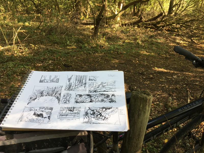
My contributions this week are a bit slight and rushed due to having too much other work and will need a revisit.  But I managed some mice and some trees.

St Gertrude’s Mice
Two mice helping to load the thread onto the spindle.

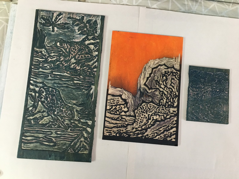
St Gertrude’s Mice: woodcut in Shina ply; image size 5 x 5 inches.


Some Trees
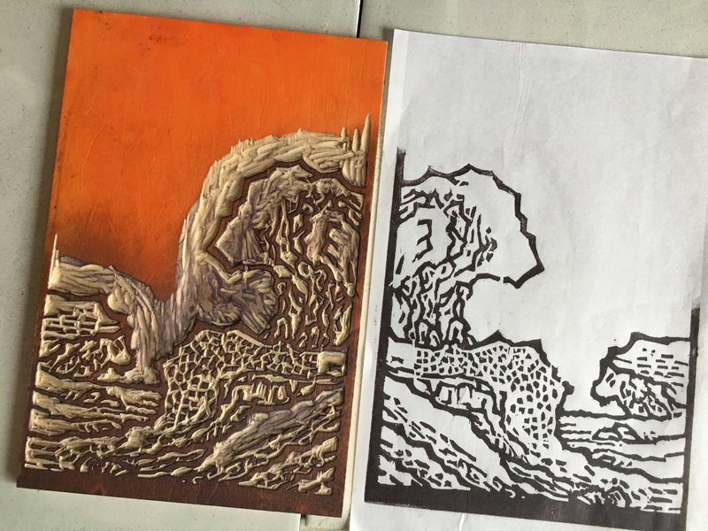
I took parts of the landscape of St Christopher’s print, three trees, the odd little rabbit and St Christopher’s leg just disappearing off to the left. This one was cut on one of the magnolia blocks but I forgot to sand the surface well before working on it, so there were printing ‘issues’. Oh well.. next time.


Block and some trials

St Christopher’s Trees: woodcut; rainbow roll on Heritage book paper; image 6 x 4 inches

While cutting these blocks and sometimes following the lines and shapes of the original, I come to a point where I wonder what the original carver must have thought, about a tricky curve or the choice of a background pattern. I wonder what was important to them, what was proscribed or their choice. Scholars of woodcuts can identify different artist or dates by looking at the cutting style of the folds in cloth.

———————————————-

Having reached woodcut number 10, I am having a short break to catch up with other work. Weekly Woodcut posts will return in a couple of weeks..
Oh! ….and that will be April!

Medieval Textiles: circa 1350-1400 CE

Weekly Woodcut Number 9: Medieval European Block Printed Cloth

This week, for my exploration into the history of woodblock printmaking I looked at a beautiful wall hanging, the Sion Wall Hanging from the Basel Museum, produced in Italy in the second half of the 14th Century.
All of life is here, birth, death, lots of fighting and some much needed music and dancing.

Upper Italy, 2nd half of 14th century: Linen printed with woodblocks
Dyes containing lampblack and red chalk : H 106 cm x W 264 cm
Inv. 1897.48
“The top register shows a row of dancing men and women, the middle register Christian knights going into battle against Oriental archers, and the bottom register some rather curious, surtitled scenes from the Oedipus saga.”
from Basel Museum here

European Block Printing on Fabric

In Europe, block printing on fabric predates printing on paper, probably arriving in Italy in the 13th Century, despite being well established in the East and India by this time. If only fragments survive it is, again, possibly because this was a more humble way of decorating fabric and therefore not so treasured. Preservation would have also been an issue as the early dyes used for European printing were not light fast although the use of mordants had been already extensively and beautifully used in India for centuries.

I also imagine that cloth generally would have been used and reused as much as possible, just as paper was. The rare insights into the clothing of working people given to us by contemporary artists show garments often patched and repaired until completely threadbare.  I begin to wonder if hand-me-down fabrics were ever given to the favoured servants,  but having just read about the bizarre “sumptuary” laws, probably not. To be fined or even put to death for using cloth deemed above your station would probably have seemed not worth the risk. But I do know that fabrics were very valuable, disassembled and reassembled according to need.

There is a famous woodblock surviving from the same period, the “Bois Protat” 1370-1380. It is thought this was made for printing on fabric because it is double sided and larger than the paper sizes available at the time. you can read more from Wiki here
Note fantastic early “speech bubble” known as a “banderole”.

To the left, a woodblock; to the right, a print made from the woodblock. In the print, three figures on the left look up at an arm on a crucifix. The right side of the print is obscured. The foremost figure speaks via a ribbon emanating from his mouth; he says in Latin: "Vere filius Dei erat iste".Le Bois Protat se prépare au public – Ad vivum

Here are other fragments of block printed fabrics produced in Venice and Germany around the same time, from a lovely collection of textiles in the Museum of Applied Arts here

As I am looking at the fabric prints I am struck that quite a few of them are quite blocky, with solid shapes in silhouette, but the cutting style of the Bois Protat and the Sion Wallhanging is fine, detailed and in outline. More like the blocks made for printing on paper which sometimes were hand coloured.
The difference could be to do with; the quality of wood used for the carving, the printing process,  the type of “ink”, the absorbency or fineness of the printing surface and possibly the function and scale of the piece. It’s all very thought provoking.

And then there are the questions of motif in early decorative prints. So many birds, deer and lions, so many leaves, vines and trees. I do not know exactly why but might hazard a guess that in the grim conditions of medieval life it would be lovely to be surrounded by images of the natural world, especially birds.
We gravity bound humans have revered, admired and envied birds for centuries and of course there is so much to admire. For me it is the ability to fly. Over the woods I see the kites soaring and the rooks circling and right now a blackbird sings exquisitely outside our bedroom window from about 5 am and the friendly robins are our constant close companions in the garden.


Weekly Woodcut no 9: Music, a Repeat Motif and Ladies in Trees.

I took a couple of details of the Sion wall hanging to work with. Time has been short this week but better to do something than nothing! 🙂

I left the war and fighting to opt for the lute player with the little dog and the disembodied tambourine player. I printed a snippet of a piece of music from the early 1400’s “Old Hall Manuscript” from the British Library (see here) behind a couple of them.

Blocks and trial prints

Again I had trouble with the quality of the wood and managed to lose the dogs right back foot.. sigh. I am fed up with this, so I have rashly decided to try some wood-engraving despite saying I would not. It’s way over the other end of the carving scale from wood-cutting but will be interesting to try.

Lute player and dog. 2 and 3 printings on Japanese hosho paper

The  borders designs are fascinating and I really prefer the way these cuts came out compared with the outlines. Giving into the chippy variations in the wood made these work better, with more energy and life. I took two of the images and made a repeat pattern.
Nice endpapers I am thinking.

Ladies in Trees

I wanted to try another way of cutting this week and so I made a sample piece based on a German textile from the V&A.  This time I used a block of magnolia wood. It’s a different cutting experience as it is solid wood and quite a bit harder than the shina ply so hold finer details. If there is anything wrong with the block it is definitely a problem with the carver, not the wood. It was rather a rush and needs a bit of refinement but generally I rather like the prints.

When I am choosing images I tend to look for non-christian and non-military and non-hunting, which sometimes restricts things. There is a possibility these ladies are collecting birds eggs.. Hmmm. So I have altered this a little and made it more of an overall pattern.

Ladies in trees: Block and prints: image size approx 120 x 160 cm

And because it was originally from a fabric I printed it on a calico scrap. Nice.

I realised after making these samples that the original fragments both have narrative themes, in that they portray action rather than just a simple repeat pattern. The choice should not surprise me because I do love a story!

Early Chinese Book Binding: 10th and 11th Centuries: A couple of samples

This is my delayed post from last week. It’s just a post about printmaking and book making which creative people all over the world like to engage in and share with each other. To be honest it seems a bit trivial right now and I am struggling. But I have to try to keep doing something vaguely normal while continuing to help and support the Ukrainian people as much as I can, along with trying to hold our appalling corrupt government to account as much as I possibly can. I wonder how long it will be before the Ukrainians can enjoy a little comfortable ‘normal’ again?

————————————————————————————————————-

I took a bit of side step from the history of printing to make a couple of simple bound booklets made in the style of some of the early printed Chinese books. Minimal cutting this week, thank goodness, as I used some early woodblocks I’d made a few years ago for one of my many tree inspired experiments.

This graphic from the Dunhuang project shows the variety of bindings that were found on the site.

In China the earliest printed books were originally in scroll form, printed from separate blocks and the sections glued together. This was quite tricky to read, especially to find a particular passage and the constant rolling and unrolling damaged the paper (normally hemp paper at this time).
The scroll then developed into a concertina form, easier to handle, to read and locate those important passages. It’s interesting to think how very popular this ancient form has become with book artists today without the majority of them knowing anything about its origin.

It seems from the article accompanying the Dunhuang graphic that quite a few styles were mixed and matched, book binders finding their own ways to enclose the texts according to need, value and portability. There is a very thorough explanation of the various bookbinding techniques found at the Dunhuang caves from the British Library here 

Of the bindings I chose to look at just two, the butterfly binding and the wrapped back binding.

Butterfly binding

Woodblock printing and the limitations on paper size made the butterfly binding a natural development from the scroll. Two blocks could be printed on one face of a single sheet and this was then folded inwards so the folds were towards the spine. Here is a rather poetic description.

“The classic butterfly binding of the Northern Song was suited to the blockprinting
technique, each leaf of paper printed on one side only. The printed sheets were folded,
ordered and pasted one to another along the fold, forming the spine.

The centre of the block, [ban xin, literally the ‘heart of the block’] was at the centre of
the book, forming the inner side of the spine, like a butterfly’s body between the wings.
When the book was closed, it was like a butterfly folding its wings as it alights on a
flower, hence the name of the format.”

PS; The Japanese binding equivalent to butterfly is detchōsō (“pasted-leaf”) binding. 

Wrapped back binding

The issue with the Butterfly binding was the obvious two blank pages in between the printed sides. This was solved by folding the sheets on the foredge and fixing the cut ends at the spine with paper “hinges”. The cover was made of a spine strip and separate glued paper covers. This is the very familiar form of traditional side bound Japanese books but without the sewing.

The problems with glue loving insects

One main snag with the glued forms was how attractive the glue was to insects. I assume that the glue was the traditional rice paste which would would have been very nutritious to the bugs. Also the butterfly form was quite fragile along the glued spine. So eventually the spines were reinforced  with silk thread,  very like the Japanese stab bound books we see today. Originally there were 4 holes, made just outside the interior paper bindings.
This way of binding is now very popular with many different decorative spine patterns much loved by craft book artists.

There is a good article about early Chinese bindings from the V&A here /http://www.vam.ac.uk/content/journals/conservation-journal/issue-38/introduction-to-chinese-traditional-book-making/


Weekly Woodcut no 8: Two small booklets; Wood and Tree

I used the old blocks and some medium weight Chinese paper .. about 50gsm for the pages, digitally printed the texts and then hand printed the woodblocks.

“Wood” The Butterfly Binding

This has the inward folded sheets glued at the spine with the two blank sheets in between the printed face.

The butterfly wing shape where the spine is glued

The cover is just two sheets of paper again glued at the spine. It could have been a wrap around but I wanted to leave the spine showing the individual folds

Tree: The Wrapped Back Binding

In this binding the sheets were folded the other way with the fold on the foredge and the cut ends at the spine. There is traditionally an inner binding which was made with paper string either tied or with the ends flattened and stiffened with glue. I have tried both here. The paper string is easy to make with Japanese paper and very strong. This holds the text block in place while a stronger or more decorative binding is made.
Additionally the corners are covered with protective paper corners.

Paper corner and paper string fixings.

I ran the text across the foredges to show the folded edge more clearly.

The cover is made with a spine strip and then two cover papers, cut slightly larger, folded over to fit the text block and glued to the spine and the first/last pages. This gives a rather nice pillowy feel to the book.

In the early books several sheets of old papers were laminated together to form covers with a decorative paper on the top.
Reading more it seems that covers were varied. Sometimes wrap around and sometimes cut flush. Sometimes a simple blue dyed paper or sometimes yellow silk. That I must try !

Opening issues.
I have to say I am not keen on the side bound, “stab stitched” books because they don’t open flat. You can help this by making a larger spine with a fold, like an old fashioned photo album,  but even then it’s a pain. The butterfly book on the other hand opens beautifully. Nowadays this form, (sometimes called drumleaf binding), is used for binding single folded sheets, gluing the blank pages together at both spine and foredge.

Top: the side bound “Tree” book and below the very flat opening butterfly “Wood” book.

Variations on Fishtail

While researching the books I came across the term “fishtail” which refers to the printed strip in between the two printed faces of a page. If you look at traditionally printed and bound Chinese and Japanese books where the sheets are folded on the foredge there is often some text/design on that fold. This design is called a fishtail and is a guide to folding the sheet as well as containing some other info, like page numbers etc.

The patterns used are fascinating and as a quick exercise I cut a block into some of the traditional patterns and then printed a few variations. Hmm nice. I will definitely be back to these.


__________________________________________________________________________________________________


Russia’s war against Ukraine. What can you do to support Ukraine & Ukrainians?

Chinese Landscape 1249 AD…and Frogs

My experimental woodcuts this week are inspired by the wonderful Chinese woodblock printed, Materia Medica printed in 1249 in the Song Dynasty, from the collection of the Library of Congress.

Jingshi zhenglei beiji bencao

Below “Preparing salt”: Two beautiful and finely cut plates describing the all important and state controlled harvesting of salt.

Bencao (Book on Chinese Herbal Medicine), compiled by Tang Shenwei of the Song dynasty and printed in Bingyang, Shansi, in A.D. 1249.
Chinese medical books appeared before the Qin period (221-206 BC). Constantly revised and added to, by the time this version was compiled the number of medical herbs detailed were well over a thousand.”
You can access the book online here.

Originally comprised of 30 juan, (a juan being roughly a “part” or “chapter”) this copy is missing almost one half of the original content at just 13 juan, bound in 10 volumes. But this is more than enough to provide me with a fascinating exploration of the visual style of woodcuts from this time.
The text and images detail remedies involving, jade, stones, grass, wood, humans, animals, birds, insects, fish, fruits, grains, and vegetables and these comforting volumes continued being popular for several hundred years.

The whole subject of these early Materia Medica is very very complex with many strange and sometimes uncomfortable ideas of what might or might not cure various ailments. The illustrations were generally drawn with brush and ink from observation by local experts in pharmacy then slightly simplified for wood cutting/printing. They were sometimes copied from earlier sources or ; “In the case of items imported from abroad, foreign merchants were to be questioned, and one or two samples of each item were to be obtained  and taken by courier to the capital to be drawn.” 

Mostly the woodcuts depict various plants which I am going to return to later when I look at other early herbals but I wanted to cut a simple landscape block to try again to emulate a brush and ink drawing.
I found the characteristic thick and thin lines very tricky to make and the chippy plywood is not really the best material to try.
It has made me even more admiring of the fine cutting skills of these early craftsmen.

Weekly Woodcut No 7: Land, Sea and Frogs

A Rocky Landscape, a tiny bit of Choppy Sea and some Frogs.

The three blocks. the largest is about 12 x 4.5 inches

Cutting these has been a challenge and yet the images look so simple! Normally I don’t cut “outlines” which involves cutting either side of the line and all around spots, all of which have to remain raised in order to be printed. Then clearing the gaps in between to avoid the chatter was a pain and very time consuming.

I did stabilise the blocks slightly with some nori paste which helped the chipping and it’s possible to varnish them if printing with oil based inks but this shina ply varies so much from piece to piece and even on the same block that I have decided not to try any fine cutting on them in the future. The original wood might well have been pear wood and so I’m going to find some to try.

However, I do quite like some of what I managed to produce, despite the chipped gaps!


Rocky Landscape from the “Bencao”  Block and first proof.

Rocky Landscape and a first print of the Choppy Sea. I think the Rocky print has probably turned out to be the most successful in trying to cut the block in the traditional way. 

More Choppy Sea. This block was way too small, at just 3.5 x 4.5 inches, for fine cutting using this ply… but a lesson learnt ie; scale up the marks to suit the wood

Choppy Seas: A variety of papers and rainbow rolls

With the weather picking up here I was delighted to see the frogs back in the pond. So for some more cutting practice I adapted one of the plates from the book replacing, what I was pretty sure were toads, with two frogs.

Frogs: Block and 2 prints.

As a finishing touch I added light yellow to the little froggy eyes and some faint moon shapes, (it was the full “Snow” moon here on the 16th Feb). We can hear the frogs gentle musical purring at night and I think they must have arrived with that full moon.

One is printed on Japanese Hosho paper and the other on a beautiful greeny Japanese Kitikata paper

Frogs and Three Moons

In all it’s been a useful experiment but I probably won’t be doing much work in this style.  Well, useful for practicing patience if nothing else. I should have liked the lines to be thinner but risked losing them all to chipping.
The prints do remind me a bit of colouring books and I have to resist the urge to get some nice crayons and carefully fill in between the lines. Colouring book? Hmm …what’s not to love!

PS .. I like to mark the return of the frogs…. see here and here.

Eastern Textile Birds: 786 AD

 Weekly Woodcut 6

This week I have returned to early printed fabrics with a flight of rather nice birds.

from the Met’s Cotsen Textile Traces Study Collection 786 AD
Museum No T-1425
Dimensions 20.30 H x 22.20 W cm (8 H x 8 3/4 W in) see here 

It is rather enigmatically described as from “China; Central Asia” and to be “printed”,  dated from around 786. But no other information is provided which is a shame.

I actually found it quite difficult to find early examples printed textiles. Textiles were definitely being “printed” before the date of this piece, usually block printed with a mordant and then dyed. It may be partly because printed fabrics, while popular, were not valued. The finest fabrics were woven and embroidered and highly prized so more likely to be used in the burial sites where most textiles have been found.

However the more I read about early textiles the more I understand about the importance of trade at this time and how many early block printed textiles traveled from India to the Far East and Egypt. It seems that very little remains of the early Indian printed fabrics in India itself, possibly because of the humid climate, but fragments have been found in Egypt at sites like Fustat and Quseir al-Qadim where the dry climate had preserved them.

The Jameel Centre at the Ashmolean Museum has a large collection of these early printed textiles and lots of information including a brief piece about the Indian Trade here.
Their printing techniques were fascinating and highly skilled. Using natural dyes, often madder and indigo, together with different mordants and resists, they were able to achieve many different shades and colours.

I particularly liked this piece from the Jameel collection, for the elegant scroll work and intricate border designs.

Date: 2nd half of the 8th century – 9th century AD
Material and technique: cotton, block-printed with resist, and dyed blue; with remains of stitching in flax.
A wide band of ornate linked scrolls is followed by a narrow band with similar, but smaller scrolls. A border next to the selvedge has linked arches with dots inside. See here

As well as imported Indian fabric there is also evidence that cloth was being printed in Egypt itself. An article by Anya King in the Journal of the American Oriental Society entitled “Gilding Textiles and Printing Blocks in Tenth-Century Egypt” has some fascinating insights into the use of woodblocks, dyes, gold and perfumes to create what must have been extremely beautiful and sensuous fabric “decoration” in 10th century Egypt. (see here)

In the 19th century many ancient textiles were found in the Al-Hawawas necropolis at the ancient city of Akhmim/Panopolis.
The collector Robert Forrer (Swiss art historian, archaeologist and prehistorian (1866-1947) wrote about the finds in his 1894 book Die Zeugdrucke der byzantinischen, romanischen, gothischen und spätern Kunstepochen which contains this drawing of a printing block found at the site.

It a completely fascinating period to research and I have to admit to spending far too much time reading, but then that’s half the joy of this project!

Weekly Woodcut Number 6

I eventually got round to thinking about the print and considering the little birds in the first fragment. There is nothing to indicate what sort of bird they actually are, but I think it might be cranes of some sort?
Having now looked at so many printed fabric, they seem to me to be stamp printed, from just one block, as they overlap in places and look pretty identical apart from the inking. I know perfect inking and printing is what some printmakers strive for but the liveliness of this sketchy quality works much better for me, and it’s interesting to think about how different inkings and pressures could be used to achieve that variety in a print.

I cut just one block and printed it in few different ways.

The Paper : This project is also giving me the opportunity to use different papers and  I printed some of the birds on a lovely vintage pale, duck egg blue, laid paper from W. S. Hodgkinson one of the classic UK paper mills based at Wookey Hole until the 1950’s. The mill had been making paper from 1610.  Shame!
The subject of paper making in the UK will come up soon, when I get to 15th century printing but the first paper mill in the UK was Sele Mill near Hertford a watermill converted to paper production by John Tate in 1488.  Paper from this mill was used by Wynkyn de Worde for his printing of “The boke of Chaucer named Caunterbury tales” in 1489.

John Tates watermark from 1489


With a backlight my Hodgkinson paper reveals a beautiful watermark with a shield, copperplate initials and the text, British Hand Made. I only use it occasionally as I don’t have much but these ancient birds seemed to deserve something a bit special.


Prints on the pale blue Hodgkinson paper and a couple on Chinese washi.

And because this was originally printed on fabric I tried a few on cotton calico.


Calico birds.

Next week some Chinese landscape…

Chinese Movable Type: 11th Century

Weekly Woodcut Number 5.

An area of early woodblock printing that I positively have to include is the creation of movable type in 11th century China, some 400 years before the introduction of movable type in Europe.

“The invention of Chinese movable type is a remarkable milestone in the history of printing, as it ushered in a new printing era, well before the well-known developments in Europe. Chinese movable type printing has been used for nearly one thousand years and greatly promoted the development and exchange of world culture; in addition it contributed to the historical progression of world civilization.”

An except from an article on Chinese movable type by Shuo Wang, Ardeshir Osanlou, and Peter Excell here 

Movable type involves making individual characters which can be arranged to make a body of text then reused. In China the first movable type was created by Bi Sheng (990-1051) and initially made from clay, something which would have developed naturally from carved clay blocks made for decoration and stamping documents.
However the small clay pieces were fragile and tricky to get flat for printing. Here is a detailed description of the technical details of Bi Sheng’s invention:

During the reign of Chingli 慶曆 (Qìnglì), 1041–1048, Bi Sheng, a man of unofficial position, made movable type. His method was as follows: he took sticky clay and cut in it characters as thin as the edge of a coin. Each character formed, as it were, a single type. He baked them in the fire to make them hard. He had previously prepared an iron plate and he had covered his plate with a mixture of pine resin, wax, and paper ashes. When he wished to print, he took an iron frame and set it on the iron plate. In this, he placed the types, set close together. When the frame was full, the whole made one solid block of type. He then placed it near the fire to warm it. When the paste [at the back] was slightly melted, he took a smooth board and pressed it over the surface, so that the block of type became as even as a whetstone. For each character, there were several types, and for certain common characters, there were twenty or more types each. When the characters were not in use he had them arranged with paper labels, one label for each rhyme-group, and kept them in wooden cases.

Translation by Tsien, Tsuen-Hsuin (1985). “part one, vol. 5”, in Joseph Needham, Science and Civilisation in China: Paper and Printing. Cambridge: Cambridge University Press. Page 201-202.

If anyone has tried western letterpress printing, the flatness of the type block surface is crucial to achieve an even print especially on a press. With hand printing there is slightly more leeway but still it is difficult to achieve that nice even impression.
As the fragility of these early clay pieces was an issue the characters were later cut in wood and ultimately cast in metal.
Despite this promising early start, because of the complex processes and the need for a certain level of literacy to assemble the texts, movable type was not further developed until the 13th Century when the astonishingly multi talented inventor  Wang Zhen developed the use of wooden type and a very neat revolving typecase.

Chinese movable type 1313 cevanzandenfig3

A revolving table typecase with individual movable type characters arranged primarily by rhyming scheme, from Wang Zhen’s “Nong Shu”, published in 1313 CE.

See this short Unesco video from 2010 about the only villages left cutting and printing movable type in China: “Wooden movable-type printing of China” 

I found it interesting to read that because of the vast numbers of characters in the Chinese language, and the complexities of the process, the early printed documents were limited to fairly simple language, and to mainly administrative documents and family registers, which rather delayed for some time the printing and popularisation of literary and philosophical works.
Some of the earliest works to be printed were medical books which I will be coming to later. I can’t wait because they are wonderful.

Here is a beautiful spread showing salt preparation from “Chong xiu zheng he jing shi zheng lei bei yong ben cao”, an edition of the classic materia medica printed in early Yuan in 1249. From the Library of Congress. here 


Fu and a Piece of Type

Part of the plan for this project is to improve my overall printing and as we are still in the middle of Chinese New Year celebrations I decided to try and make a woodblock of the Chinese “fu” good fortune symbol, printed in the traditional way with a baren and watercolour. I have tried this form of printing quite a few times and love the soft quality of the watercolour on Japanese paper. But it is tricky.

The aim of the early Chinese and Japanese woodblock printmakers was to “copy” brush lettering to emulate a hand written document. The slightly broken edges and brush marks at the ends of the stroke making it more like brushwork. It’s called a “Kasure” cutting technique.

I think I am improving somewhat and have at least one decent print with bokashi ( shaded colouring) and woodgrain showing.

FU… “Good Fortune”

Fu and the block…Handprinted on hosho paper with watercolours 

Should you make your own Fu symbol, for even better luck during the spring festival, hang the the symbol upside down. This is because “the phrase an “upside-down Fú” sounds nearly identical to the phrase “Good luck arrives”. Pasting the character upside-down on a door or doorpost thus translates into a wish for prosperity to descend upon a dwelling.” see Wiki here.

A Character Block and Shards of wood.

For an alternative I decided to make a reduction print of a character block with its cast shadow and I’ve included some of the shards of wood which clutter up my workspace almost daily at the moment. This is more an exercise in registration and overprinting than cutting. The trick is to print lots and lots and lots of the first colours so you have enough to work on as you cut away the layers. I never print enough..

Block and print after 3rd colour

Block and print after 5th colour .. not much left of the block now! 

A couple of stages of the colours before overprinting

I made one set based on blues and another with a yellow as the first colour.

“Type block” 5 colour reduction woodcut. 5 inches square.

Next week more fabric..


An Almanac AD 877… & Happy Tiger Year

I have to confess to loving an almanac! Any almanac. Complex diagrams, instructions, prophecies. A nicely organised year set out for you to take away some of the uncertainty of the unknown future, very neatly put here by Bernard Faure…

A calendar ….implies a domestication of time, as response to the anxiety caused by the constant flux of nature and things, By fragmenting time into increasingly small units it reassures people.

Bernard Faure in a review of Marc Kalinowski’s Divination et société dans la Chine médiévale  here

Almanacs were incredibly popular throughout the world for centuries and to some extent still are. My next post looks at the beginnings of movable type in China but it is interesting that Gutenberg printed almanacs before his famous Bible, so much was the demand and the profit! And as we are coming up to Chinese New Year this seemed an appropriate choice.

A Chinese Almanac Fragment from AD 877

This is possibly my last printing experiment based on the manuscripts found in Dunhuang and it’s from a wonderful almanac fragment, an intensely complex document, 29 cm high and in its entirety 115.5 cm long.

It would have been cut into separate blocks of wood and printed simply by inking, possibly with pads, and then pressing paper onto the surface and rubbing from the back.

British Library Or.8210/P.6
woodblock print on paper

You can see enlarged sections of the scroll at the International Dunhuang Project here

This beautiful scroll is split into sections which include zodiac animals, lucky and unlucky days, fengshui diagrams, charms and amulets.

Many Chinese households will regularly consult an almanac (or calendar) based on the lunar year that provides a set of guidelines to promote or advise against certain tasks or events being undertaken on certain days. Claims for the origins of this book go back over 4200 years to 2256 BC, from which date it is said to have been in constant publication. Originally produced solely by the imperial palace whose supposed link to the Heavens offered the ultimate authority on all matters celestial, the almanac is now freely published, but a certain ritual still surrounds its use. In its handling, clean hands and a degree of reverence are required. Old almanacs must be disposed of by burning, either at a temple or with care by each family, in order to release their powers back to Heaven and the almanac must always be stored with respect and never placed on the floor or beneath a table. Despite the lighthearted treatment of astrological suppositions surrounding the zodiac, the respect afforded to the almanac reveals the ongoing belief afforded to the more complex arts of astronomy and divination and their importance in Chinese society.

From an overview of the role of the Chinese Almanac, published by the Dunhuang project here 


Detail of the zodiac figures from right to left:  rat, ox, tiger, rabbit (or hare), dragon, snake, horse, sheep (or goat), monkey, rooster, dog and pig (BL Stein Collection Or.8210/P.6International Dunhuang Project website

I am very fond of the lively cutting style of the animals particularly the little snake simplified to an arrangement of geometric shapes.

Almanac Censorship

An important side issue is who controlled the printing of almanacs. In China the State tried to restrict the information the public received by only allowing state approved almanacs to be printed but often local printers would risk prosecution and make their own, so high was the demand and the profit.
Under the Censor’s Eye: Printed Almanacs and censorship in ninth Century China is a PDF written by expert on the silk road artifacts Susan Whitfield.  If you have time to read this, it will explain everything! https://www.bl.uk/eblj/1998articles/pdf/article2.pdf
Susan is Professor in Silk Road Studies, Sainsbury Institute for the Study of Japanese Arts and Cultures and the University of East Anglia. Author of many books and articles… I have two of her books now 🙂

The Images

I had a very hard time deciding what to choose from this fabulous piece, and looked at a few images; the creature at the base of the scroll,  the zodiac animals and these very strange figures situated further to the left of the zodiac animals.

But what are they? It has taken me 3 weeks and some extensive research including contacting Silk Road expert Susan Whitfield who I mentioned above. So I am very grateful to learn via her and her colleague that they are 5 demons or ghosts associated with illnesses.
After a bit more digging I find that if you were suffering from an illness on a particular day it could be linked to a certain demon. For a cure  you would need an “talisman” or written charm to dispel the malaise brought on by this unwelcome being.
Activating the charm entails either ingesting the charm, (first burnt and the ashes mixed with wine) or pinning it to the door to ensure the disease carrying demon would not enter the house.
These things are useful to know especially at the moment.

Almanac Animal and Tigers

Eventually, not wishing to inadvertently whistle up some demonic presence, I chose the little creature featured as the largest image on the scroll.  Boar or Ox?

I made a small reduction print in two colours. A simple enough exercise but it does involve some registration which is always an issue for me!

Block and stage prints

The Almanac Animal.. 10.5 x 8.5 cms printed on Chinese paper (you can see the original stamp on the paper at the top right)

New Year Tigers

Then, because the coming week welcomes in the Chinese New Year I looked again at the zodiac animals.
The tiger in the Dunhuang Almanac looks rather like a small domestic cat  but I did want to celebrate this welcome new year so I turned to early Chinese stone rubbings.
The earliest known rubbings date from some 200 years before the almanac and were created by pressing damp paper over carved stone texts or images and then inking the paper surface. ( You can find lots of information and beautiful images from the Field Museum here )

The effect will also happen when printing woodcuts onto thin papers using a baren. The image will appear on the back, a technique used by some artists use to create soft, textured print images.

So I cut a block with my adaptations of an early Chinese “feline” image.  I much prefer the original …mine are just much too cuddly.

To replicate a traditional way of printing I inked the block with black sumi ink and printed the image with a baren on a thin natural coloured Chinese paper and stenciled in some spots in lucky red.

Two tigers: image 16 x 28 cms printed on natural coloured Chinese paper

The image showing through on the back of the sheet after printing

Block and prints

I also made a few other prints to practice my registration technique…. I will improve!

Some traditional red and green…

Some more variations, including two printed in jade on a gorgeous Chinese “dragon cloud” paper. A fine silky paper with fibers and flecks of gold leaf.

The paper is very translucent, my hand shows slightly dark behind the paper.

And finally a mix of green, red and dark grey…

New Year Tigers. 3 colour woodcut 16 x 28 cms on Chinese rice paper


Happy Chinese New Year!

1 Hundred Buddhas and 1 Million Charms

This week it’s all about Buddhas and I am jumping between China and Japan but the main image comes again from the Dunhuang Caves. There are so many wonderful paintings, fabrics and documents to become engrossed in it will be hard to drag myself away. I think there will be at least one more post involved.

Buddhas or Bodhisattvas from the British Library : China

Museum number 1919,0101,0.258
9th century

Curator’s comments Zwalf 1985

Among the variety of Buddhist woodblock prints at Dunhuang, those which most eloquently witness personal devotion are fragments of long scrolls, joined sheets of paper carrying hundreds of individually impressed Buddhas or Bodhisattva. One scroll bears dates showing that twenty-one images were printed on certain days each month. The practice spread to Japan where blocks were commonly engraved with ten or 100 small images. There the printed sheets were paid for by devotees but retained by the monastery and enclosed in bundles within carved wooden images.

Printing in all its early forms, from stamps to woodblock to metal plates, was eagerly adopted by the Buddhists as the dissemination of the  knowledge and teachings of Buddha is encouraged to both spread the word and add to the number of good deeds required to ensure a good afterlife. Many Buddhist texts have been found from these early days of printing some like the Diamond Sutra with illustrations.

This is from a very interesting article about Buddhist books from the Navin Kumar Gallery

“No other world religion has made use of such a variety of materials and techniques to transcribe and enrich their sacred books. The Buddhists also cherish a fundamentally different attitude than the Christian or the Muslim toward their sacred texts. The sutras were often copied not for personal use but for several other purposes. Both arduously and beautifully written and even illuminated, books were frequently deposited in stupas and images for one reason or another. The Buddhists firmly believe that such acts not only increase their personal merit but help preserve the faith for posterity as well as augment the efficacy of the monument or image. The Buddhist was never allowed to lose sight of the altruistic aim of commissioning and copying a book and was constantly encouraged literally to worship it. As the Buddha himself tells the god Sakka, or Indra:

But again, Kaus’ika…if someone else truly believes in the Perfection of Wisdom. . .copies it, and preserves and stores away the copy,—so that the good dharmas might last long, so that the guide of the Tathagatas might not be annihilated, so that the good dharma might not disappear, so that the Boddhisattvas, the great beings might continue to be assisted, since their guide will not fail—and finally, honours and worships this Perfection of Wisdom; then the latter begets the greater merit.

 From https://www.navinkumar.com/content/books/manuscripts1988/introduction.html

The Million Pagoda Charms: Japan

British Library Or 78.a.11

The Hyakumantō darani or ‘One Million Pagoda Dharani’ are the oldest extant examples of printing in Japan and one of the earliest in the world. The eighth century Japanese chronicle the Shoku Nihongi records that they were printed between 764 and 770 on the orders of Empress Shōtoku as an act of atonement and reconciliation following the suppression of the Emi Rebellion led by Fujiwara no Nakamaro in 764. Each of the charms was printed on a small strip of paper and placed in a miniature wooden pagoda. The pagodas, which were originally painted white, were then distributed among the ten leading Buddhist temples in Western Japan.

See more from the British Library here: https://www.bl.uk/collection-items/one-million-pagoda-charm

This act of atonement involved the massive undertaking to print “1 million” dharani. The text was carved on a series of wooden blocks, (not separate characters), inked and the paper pressed onto the surface.  Many of the little pagodas with their “charms” still exist in museums and temples.

An article from Atlas Obscura makes an interesting comparison with this early large scale printing task with Gutenberg, If you are interested see here.  https://www.atlasobscura.com/articles/japanese-buddhist-scroll-gutenberg

The Empress Shotaku/ Koken Wikipedia here

An 18th C painting on silk of the Empress Shotoku looking suitably contrite. She has good reason to because, apart from suppressing rebellions, disposing of her cousin and having an affair with a monk who she promoted to high office, she was deemed responsible for the perception that female Empresses could not really be trusted and so rarely since the 8th Century have women been in charge.

No 3: 200 Bodhisattvas and a Pagoda

Before continuing I had to decide what to call my seated figures: Buddhas or Bodhisattvas. I decided Bodhisattvas were more apt as they are the beings still in search of enlightenment dedicated to helping humanity rather than the fully enlightened Buddha.

Initially I took just two of the figures in their meditation pose, to make a small stamp-like woodcut but that seemed neither respectful enough or diligent enough when compared with the early printings so I decided to go for 100. And so one print developed into a scroll.
Yes, it was a bit rash but it made me think about the meditative process of repetition, so key to Buddhist practice, and then it was all rather relaxing and lovely.

Thinking about sacred saffron again and to make it slightly more interesting to print I decided on a shaded roll and changed the emphasis from yellow/orange at the beginning to orange/red at the end rather like a saffron stamen.


Blocks and prints on rice paper and prints drying in the sun

Yellow to orange and orange to red shaded rolls

Just a few Bodhisattvas..

And a scroll.

100  Bodhisattvas printed on rice paper. It’s approx 11 cm high and very long..

The Pagoda

I was going to stop there but felt the Bodhisattvas needed a home. Not having time nor ability to make a beautiful turned wooden shape I made a little paper pagoda.


Woodblock and rainbow roll prints.

I tried two different colours in rainbow rolls and as this is was not really in scale with my scroll I made a smaller version of the Bodhisattvas scroll. So tiny they could easily step into their pagoda. 🙂 ..

Yes!  There really are exactly 200 Bodhisattva in all, even though you can’t see them, I (and the Buddha) know!

A Little Colour Theory from 9th Century China

This week’s woodcut experiment is perhaps more about printing than cutting. Again a piece from Dunhuang but this time a fragment of “clamp dyed” cloth, where wood was used for this form of dyeing/printing as carved pattern blocks.

I have found this method of printing very difficult to get my head around but, simply put, the fabric was clamped tightly between the two patterned wooden boards and then dyed in a vat. The raised surface of the wood clamping the fabric “resisting” the dye and forming the white areas.

These particular pieces of patterned silk are held in the British Museum:

British Museum : MAS.878.b
8thC(late)-9thC

Description: The clamp-resist dyed pattern on the buff-coloured silk consists of interlocking rosettes, each with four petals and four leaves in blue and red….in the dyeing process of these textiles, two sets of patterned blocks were used, however, some of the green leaves have been dyed twice, with painted yellow on dyed blue, just as the purplish brown areas have been dyed both scarlet and blue.
Four pieces of the same textiles are preserved, two in the British Museum, and two in V&A LOAN:STEIN.591 and 298.
And from another source:
Two sets of blocks were used for dyeing, first to create blue, orange, and brown via the overlapping of blue and orange, then
yellow was painted on blue and orange, to create green and light orange, …..

from “Woven Color in China,The Five Colors in Chinese Culture and Polychrome Woven Textiles”  by Zhao Feng

Colours were important yin and yang elements and it’s interesting that they are based on the primary colours which when combined would give the greens, browns etc. The following explains a little.

In ancient Chinese culture, there was the yin-yang theory and five-color system that included red, blue,
yellow, black and white. Each color refers either to one of the five directions or positions, east, west,
north, south and middle, or to one of the five planets, Venus, Jupiter, Mercury, Mars and Saturn, or to
one of the five materials, metal, wood, water, fire and earth. This theory was recorded in the Zhou Li (Rites of the Zhou)

again from “Woven Color in China,The Five Colors in Chinese Culture and Polychrome Woven Textiles”  as above.

For me, knowing the cultural significance of the colours makes the pieces even more interesting. I’m also looking at the pigments used in these early printings which is yet another branch research!

Another 2  clamp dyed fragments in the British Museum also from the Dunhuang caves are these, one featuring two geese which also shows overlaying of colours and another a snippet of an elegant high stepping deer.

British Museum MAS.876: one of two square-shaped fragments of plain woven silk patterned with the clamp-resist dyeing technique. The pattern consists of two motifs: a dominant large roundel with encircled rosettes and a narrower inner roundel, enclosing four paired geese; and a four-petalled flower in the centre, and the other secondary quatrefoil. The repeat in the warp direction is about 56.6 cm but it is unclear in the weft direction. Another fragment from the same textile (but without geese) is in the State Hermitage Museum, St Petersburg (Дх51). Image from IDP 

British Museum: ref numbers MAS.876 and MAS.874.b also from Mogao: Cave 17 8th/9th Century.

It seems this form of multi coloured clamp dyeing started to decline probably because of the complexity of the process and gave way to the simpler one colour “jaixie” printing. It’s all very lovely and I will be making a sample based on the jaixie (and its Japanese equivalent itajime) techniques in a couple of weeks.

I am definitely not going to try to make clamp resist boards at the moment so my interpretation was to cut the same design but print it in a more conventional way. I used one block and printed the orangey/yellow first using some paper to mask the blue areas, then cut away the orange and printed the blue, so the third colour is achieved by the overprinting.

Printing on Chinese papers in various colours.

I printed some with an overlay of a second block cut with fine lines to unite the colours and give an effect of a weave.
See image below on linen paper.

Because the original fragment was printed on silk  I thought I should try and it was rather lovely. I have not printing on fine (slippery) silk before and it was Ok but there must be a good way to get the registration right.  I think possibly by stretching the silk and printing from the top, in the way Indian woodblock printmaking is done. More experiments needed but the result is quite nice.

Woodblock printed on pongee silk sample

I had to try the little deer as well with a slightly different way of printing, using a couple of additional blocks for the background and the clouds and a variety of papers/ colour mixes.


No 2: Clamp Dyed Fabric Designs from Dunhuang

3 colours printed on a Korean linen paper. 

Deer with clouds: 3 colours on hosho paper.