
I am still struggling to produce much work and inspiration is lacking. I understand by talking to some of my other creative friends that this seems very common! But this month I am starting a small project which I hope will be finished in 3 weeks time.
Meanwhile I should conclude the posts about the bird book which was completed last year. So this is a little bit about the binding, a drumleaf binding which allows single spreads to be bound together.
Finishing the Backgrounds
Having basically done the back grounds (see here) … They needed some additions before assembling, some tweaking and finalising.

I wanted to reflect the sheen on the wings of birds by adding small amounts of mica here and there. It is so lovely and adds to the feel and texture of the printed pages.


I punched holes in the prints (ooh a bit nerveracking) to allow for the numbers of the colours which would correspond to the numbers on the bird prints, again relating back to Bauer’s numbering system.


Endpaper and Prelims
Then before the binding I had to consider the endpapers and the prelims. I decided to make the ends quite simple, printing them on some lovely canson paper. ( I was also running out of time).

The text pages were digitally printed on Japanese Awagmi paper. Very nice quality and definition.
Once the block was assembled it was glued along the back and strengthened with Japanese paper.

Book block clamped for gluing… it was hard to keep the spine level which is important to keep the book block straight before trimming with a horizontal plough.
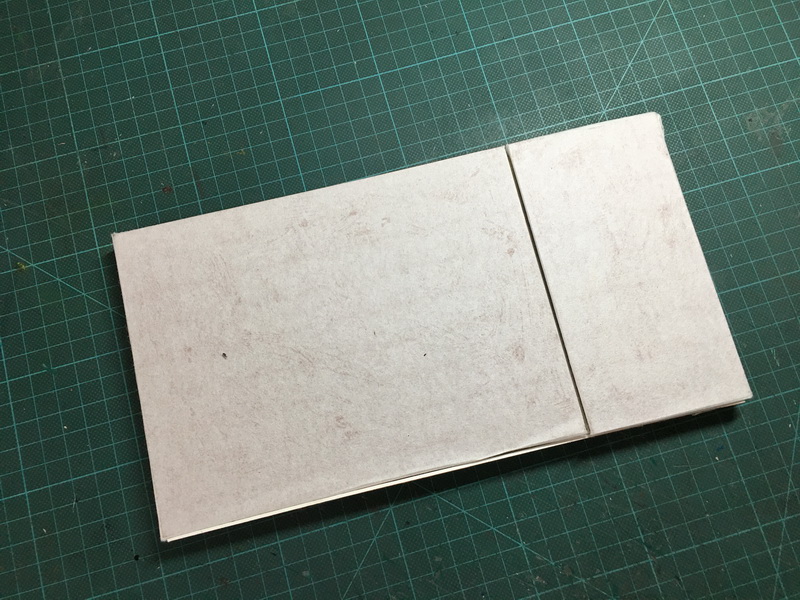
Then the pages were also glued along the spine edges for extra strength. I had to make a complete dummy with the correct papers to make sure all this would work and to practice trimming the edges, also nerveracking.

My test block trimmed … nice ! Thank you to Sue Dogget for showing me how to use the plough.
The Cover
Having the book block assembled OK. I started the cover.
It was designed to be roughly monochrome with just a few highlights of colour. So I decided to feature birds which are predominantly black and white, to keep the theme of the black and white bird images inside the book. Lino cuts were made of the gorgeous spotted woodpecker and a little wagtail and a coal tit and printed in grey on home made calico bookcloth.


I had decided early on in this project to try some leather work on this book, having done a lovely short course with Ina Baumeister at City Lit which gave me some insight into working with leather. This was probably the most stressful part of the job because the leather is expensive and beautiful and I really didn’t want to ruin it. I inlaid the black leather with the little chips of coloured leather.. phew it was so tricky to keep it all clean! ….


The colours corresponded with the colours I chose for the birds and I joined the cloth to the leather with a strip of red leather
The spine is constructed to open quite widely to enable the pages inside to lie flat. So it was necessary to attend to the parts that could be seen when it was opened. I lined the back of the spine with thin black leather and the top of the boards with red leather and made a little red leather headband.

There are many aspects of this whole project that might have been done differently (ie better) but I was just so pleased it worked!
In all I am happy with it, especially having put it away for year. I learnt a huge amount about papers, printmaking, book construction etc etc.
Here is the bound book:


Tomorrow I am going to post the spreads ! Yay!
Oh my, this is beautiful. The cover looks stunning with the lino cuts of the birds and the leather. You really know how to make things hard for yourself don’t you, with those coloured leather inserts. I’m in awe!
Hi Jane .. thank you so much! You are so right about making things hard:) but I tend to think nowadays I need to have a new challenge with each project.. Why?? I am not quite sure :)!