
Just a few sketches to get started as this next year I shall be considering combining image with type, more than I ever have before. I was never a typographer or been able to write in any sort of elegant calligraphic way. It all seemed too controlled for my nature. Back in the pre computer days it seemed a dreary task to hand render everything, measure everything or use the awful ever cracking Letraset. Running out of “e”s was just a perpetual headache.
But now, ironically, when I could do so much on the computer I am more and more interested in the hand drawn letter forms. I am starting to think about hand cut letters and how I might be able to combine them with images.

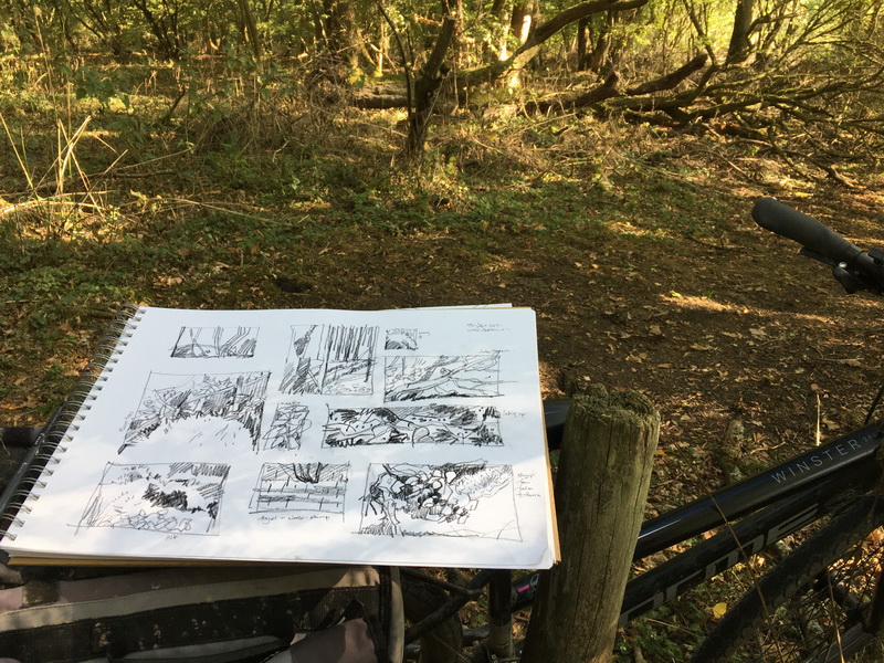
A5 sketchbook and pen, very cheap, nice thin paper. I like thin paper.
I had started off last week not really knowing what to do. Freehand drawing of letterforms hand seemed a good idea. Now I find myself looking more carefully. Here are a few from last week. They are a random bunch.


This week in particular I have focused in on older letter forms which fits in more with this next year. I am about to go to past times .. old texts and herbals.
![type-2-copy[4]](https://lh3.googleusercontent.com/-SODkGOVR5r8/ViOphAHVV6I/AAAAAAAAUtQ/rvAHYXdlgrc/s1600-h/type-2-copy%25255B4%25255D%25255B4%25255D.gif "type-2-copy[4]")
Nine of the sketchbook type drawings.
They are completely fascinating. As soon as you start drawing them you can see connections and rhythms that are not so obvious from just looking. So many ideas ….
you have some wonderful letters.
i like how you create many different styles.
Amazing… I am, and I don't know why, very attracted to caligraphy… And drawn letters! I very happy you' ll follow that path too.
I love this post…Beautiful drawings and lettering.! Thankyouthankyou for sharing your work and inspiration. 🙂